
How to Use Notifications in Telerik UI for ASP.NET Core

The Notification component in the Telerik UI for ASP.NET Core library makes adding, customizing and event-setting a snap. See how to make it your own.
A Brief History of Notifications
The evolution of web application notifications is a story unfolding alongside advancements in web technology and transformations in user experience paradigms.
Initially, the web was a somewhat static realm where JavaScript alert boxes functioned as primitive notification tools. These warnings were annoying, preventing user interaction until they were manually ignored. It was a time of simplicity but intrusiveness, harkening back to when web interactivity was in its infancy.
Polling techniques arose as a more dynamic approach to retrieve information as the web matured. Web applications periodically send HTTP queries to servers inquiring about fresh data. Although this solution was more engaging than alert boxes, it was resource-intensive and had latency difficulties.
Simultaneously, third-party plugins such as Flash provided a non-standard but more visually attractive way to present notifications, similar to an elaborate but inconsistent postal service.
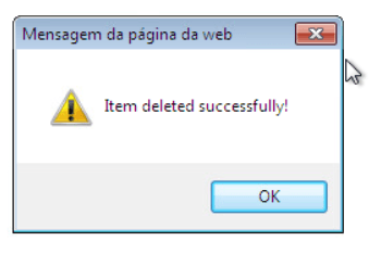
JavaScript alert on Windows 7.
The popularization of AJAX (Asynchronous JavaScript and XML) was a watershed point. This technology enabled webpages to update real-time portions without a full page refresh. This change allowed notifications to be placed directly within webpages as banners or popup windows, significantly improving the user experience by providing a less disruptive flow.
With the arrival of HTML5, the notification landscape advanced yet further. WebSockets, for example, enabled real-time, two-way communication between the client and server. This game changer allowed real-time updates to be supplied quickly and efficiently.
The Notifications API was also released, which provided native system notifications that could be displayed outside the browser window, similar to desktop notifications. Sound notifications and dynamic modifications to the favicon (the little icon displayed in a browser tab) were also feasible, adding extra layers to the user experience.
Another adjustment was necessary due to the pervasiveness of mobile devices. The designs grew more streamlined and less invasive to accommodate smaller screens and touch interfaces. Push notifications have emerged as a significant feature, particularly on Android smartphones, leveling the playing field in their capacity to engage customers via alerts across online and native applications.
Notifications were made actionable, allowing users to complete tasks straight from the notification pane. A user-centric approach was implemented by incorporating features that enable user customization of notification types and delivery. To address the issue of notification fatigue, the design began by grouping comparable sorts of messages and providing summaries.
The introduction of progressive web apps (PWAs) marks the current pinnacle of progress. They made it possible to get notifications even while the web application was not open in a browser tab, resulting in a native app-like experience.
Telerik UI for ASP.NET Core Notification
The Notification component in Progress Telerik UI for ASP.NET Core streamlines how messages are sent to users in the ever-changing web development world. This component functions similarly to a versatile messenger, delivering quick messages, such as alerts, confirmations, status updates or warnings. Its versatility sets it apart—it’s designed to accommodate a wide range of scenarios, from Razor Pages to Right-to-Left (RTL) layouts, bespoke templates and more.
Another distinguishing feature of the Telerik UI for ASP.NET Core Notification component is its ease of installation. This post will lead you through the steps necessary to create the element, from preparing the CSHTML file to initializing the notification, which includes primary content and an action button. It does not stop there—it also covers hiding the notification with a button, handling notification events and referencing existing component instances.
Let’s Get Started!
- Create your Telerik UI for ASP.NET Core project:
- Choosing between HTML and Tag Helpers:
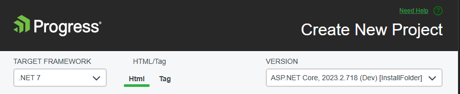
During the project creation process, you can choose between HtmlHelper and TagHelper. This choice could significantly impact your development workflow. Therefore, I recommend discussing with your team which option best suits your collective skill set. Below, you can visualize how each type works.
- On the target page, add the notification component:
HtmlHelper
@(Html.Kendo().Notification()
    .Name("notification")
    .Position(p=>p.Top(120).Left(20))
    .Button(true)
    .HideOnClick(false)
    .Events(e => e.Show("show")
     )
)
TagHelper
<kendo-notification name="notification">
    <position top="120" left="20"></position>
</kendo-notification>
Choose the best place to put your notification by setting position top and left.
- Create a function to display messages if you display multiple messages.
1.	function showNotification(message, typeMessage)
2.	{
3.	    if (typeMessage == undefined) typeMessage = "success";
4.	    var notification = $("#notification").data("kendoNotification");
5.	    notification.show(message, typeMessage);
6.	}
Both HtmlHelper and TagHelper work with the script above.
- Call the notification according to the type of message and event. Below is the code and after that, a picture of the messages:
1)	function deleteItem(key) {
2)
3)	    if (key == "2") {
4)	        showNotification("Error while deleteing!", "error");
5)	        return;
6)	    }
7)	    if (key == "3") {
8)	        showNotification("You can delete one item each 10 minutes!", "warning");
9)	        return;
10)	    }
11)
12)	    $("#item_" + key).remove();
13)	    $("#previewItem_" + key).remove();
14)
15)	    showNotification("Item deleted successfully!");
16)	}
17)
18)	function cancelItem() {
19)	    showNotification("Edition cancelled!", "info");
20)	}
21)
22)	function saveItem() {
23)	    showNotification("Item saved successfully!");
24)	}
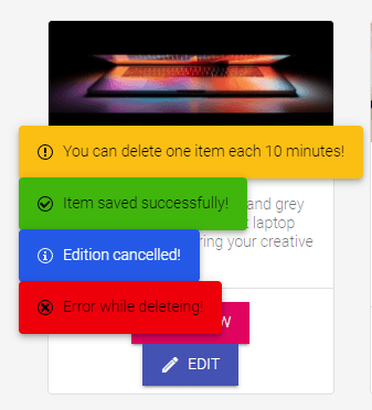
The figure above shows the types: warning, success, info and error.
Customizing the Behavior of the Notification
Settings like “Hide on Click,” “Auto Hide After” and “Allow Hide After” are very important for making it easier for users to connect with and use an interface.
The “Hide on Click” setting lets you hide an element when it is clicked on. This is useful for getting rid of emails or messages already seen. With “Auto Hide After,” you can hide parts automatically after a specific time. This is great for showing temporary alerts. With “Allow Hide After,” on the other hand, users can choose to hide a part themselves after a certain amount of time has passed.
These settings are crucial for system approval because they help users know what they are doing and find the interface easy to use. The interface stays clean and helps users focus on their jobs by letting parts be hidden automatically or by hand. Also, letting users choose when parts are covered makes the experience more personalized and easy to use. Overall, these choices make the system easier to use and more accessible, which makes it more engaging for users.
HtmlHelper
@(Html.Kendo().Notification()
  .Name("notification")
  // Hide automatically after seven seconds.
  .AutoHideAfter(7000)
  // Prevent accidental hiding for one second.
  .AllowHideAfter(1000)
  // Show a Hide button.
  .Button(true)
  // Prevent hiding by clicking on the Notification content.
  .HideOnClick(false)
)
TagHelper
<kendo-notification  name="notification"
  auto-hide-after="7000"
  allow-hide-after="1000"
  button="true"
  hide-on-click="false">
</kendo-notification>
Additionally, we can tinker with the Notification and create a custom message. In my sample, I added a logging notification:
How Do You Do It?
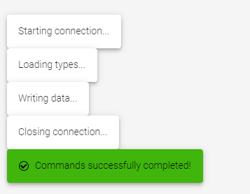
- Choose a tag. I chose “unknown.”
1.	$(document).ready(function () {
2.	    showNotification("Starting connection...", "unknown");
3.	    showNotification("Loading types...", "unknown");
4.	    showNotification("Writing data...", "unknown");
5.	    showNotification("Closing connection...", "unknown");
6.	    showNotification("Commands successfully completed!");
7.	});
- Alter the CSS to hide the default icon space:
span[title="unknown"] { display: none !important; }
CSS with the
!importantclause is generally considered a bad practice because this alters the default appearance of the Notification component. A better way of achieving this is by using a template.I considered using this CSS with
!importantas a trick for an immediate result. It should be viewed as a technical debt.
- Call the notification function:
1. showNotification("Starting connection...", "unknown");
The sample uses CSS, and the unknown is a trick. Remember that this is not a valid type for the Notification component. Valid options are info, success, warning and error. It is possible to have a custom type. However, for it to work, a template should be defined. For example:
1.	<span id="notification"></span>
2.
3.	<script>
4.	function getNotificationMessage() {
5.	    return {
6.	        myMessage: "foo text"
7.	    }
8.	}
9.
10.	var notificationWidget = $("#notification").kendoNotification({
11.	    templates: [{
12.	        type: "unknown",
13.	        template: "<div>System alert: #= myMessage #</div>"
14.	    }]
15.	}).data("kendoNotification");
16.
17.	notificationWidget.show(getNotificationMessage, "unknown");
18.	</script>
See more in the Notification documentation for the show method.
Or directly:
1.	var notification = $("#notification").data("kendoNotification");
2.	notification.show(message, typeMessage);
Altering color and background color:
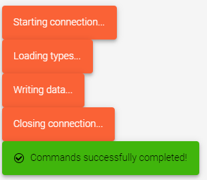
Alter the CSS according to your tag, in this case “unknown”:
.k-notification-unknown { color: white; background-color: #ff6633; }
Conclusion
The Telerik UI for the ASP.NET Core Notification component embodies variety and usability. It provides a diverse approach to notification presentation while keeping the setup procedure as simple as possible, balancing the ideals of effective user communication with the practicalities of fast web development.
Download a trial of Telerik UI for ASP.NET Core and start using Telerik UI immediately. Rest assured, you can reach out to the legendary support team for assistance at any time, even during the trial period.
Even better, download a trial of Telerik DevCraft and get a look at the powerful suite of tools you can get in that bundle.
References
- You can access this code from GitHub.
- Docs – https://docs.telerik.com/aspnet-core/html-helpers/layout/notification/overview
- Hiding – https://docs.telerik.com/aspnet-core/html-helpers/layout/notification/hiding

Jefferson S. Motta
Jefferson S. Motta is a senior software developer, IT consultant and system analyst from Brazil, developing in the .NET platform since 2011. Creator of www.Advocati.NET, since 1997, a CRM for Brazilian Law Firms. He enjoys being with family and petting his cats in his free time. You can follow him on LinkedIn and GitHub.
Related Posts
Comments
All articles
Topics

Latest Stories
in Your Inbox
Subscribe to be the first to get our expert-written articles and tutorials for developers!
All fields are required