
Telerik UI for ASP.NET Core
What's New R3 2023
What's New HistoryBrand-new Telerik UI for ASP.NET Core DockManager Component
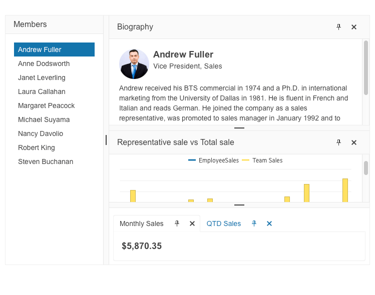
Leverage the new UI for ASP.NET Core DockManager component to recreate a desktop-like experience in your web apps. It allows you to replicate the docks along with their respective behavior in desktop applications, such as Visual Studio. The DockManager gives you the ability to have full control over the layout of your application through panes, which enables end users to alter the existing layout by pinning, resizing and moving panes.
If you are looking to migrate from a desktop framework to ASP.NET Core, the DockManager component will significantly speed up the process without breaking the user experience in the meantime.
See the Telerik UI for ASP.NET Core DockManager demo
Telerik UI for ASP.NET Core Chart Series Enhanced with a Pyramid Chart
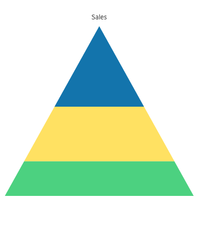
Leverage the Telerik UI for ASP.NET Core Pyramid Chart to visualize a single series of data in progressively increasing proportions. These data series are organized in segments where one represents the value for the particular item from the series. The values of the items also influence the height and the shape of the corresponding segments.
Pyramid Charts are suitable when you want to compare and contrast your data, communicate data in an easy-to-read format, understand large amounts of data quickly or display the relative proportions of different items. This Chart series is often used to represent stages in a priority process, population visualization, singular datasets, etc.
See the Telerik UI for ASP.NET Core Pyramid Chart demo
Introducing DrillDown Support for Telerik UI for ASP.NET Core Charts
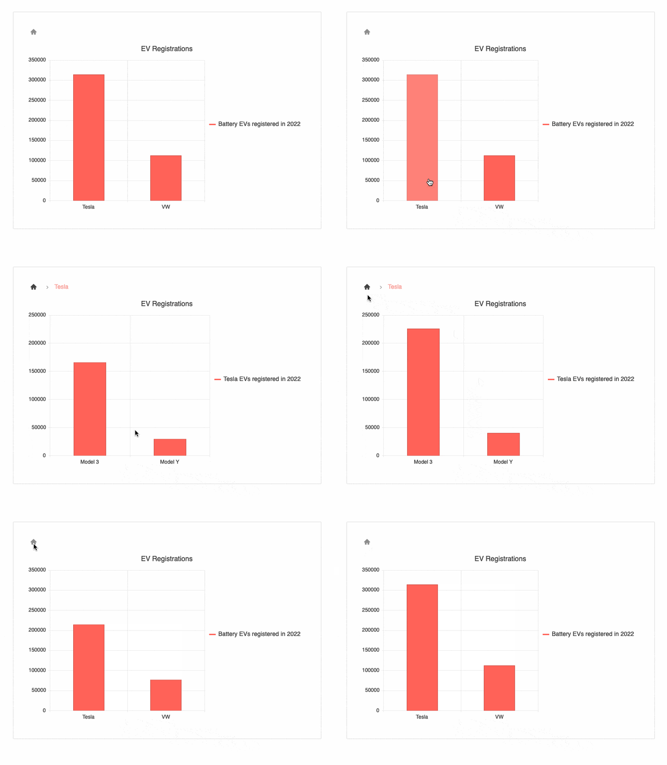
Elevate charting experience, explore and analyze data in depth leveraging the new DrillDown feature in Telerik UI for ASP.NET Core Charts. Access new information by clicking on any series of the Chart, allowing you to inspect the entire data structure with minimum effort.
See the Telerik UI for ASP.NET Core Charts DrillDown demo
Convenient Context Menu in Telerik UI for ASP.NET Core Grid
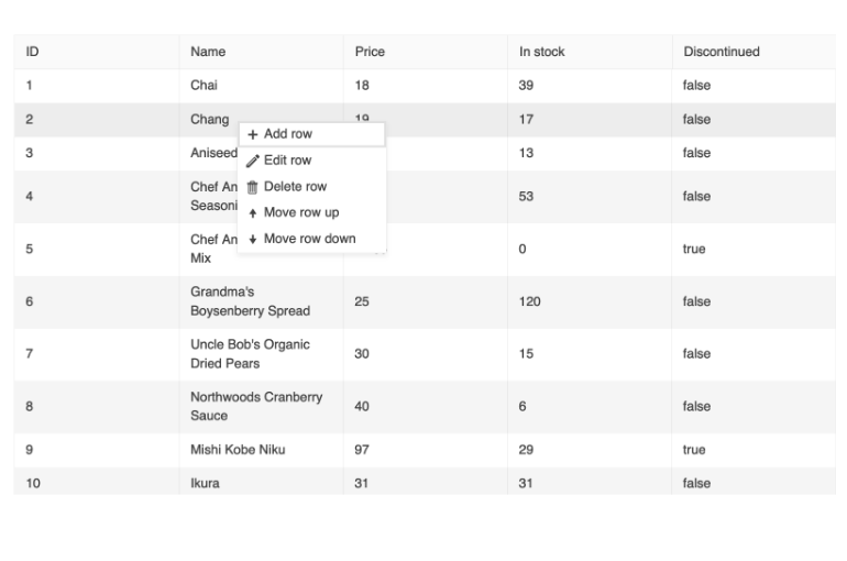
A brand-new context menu is supported in Telerik UI for ASP.NET Core Grid. It allows you to elevate user interactions with the component by displaying a context menu that provides a convenient way to apply data processing operations to specific rows. The context menu empowers users to easily add, edit and delete records, select, sort and reorder rows, and export the data grid to a PDF or Excel file.
Additionally, the context menu supports the option to use default commands or add custom ones. You can also configure the items that are displayed in the Grid's table head element and those in the Grid's table body element.
See the Telerik UI for ASP.NET Core Grid Context Menu demo
Modernized Experience in Telerik UI for ASP.NET Core Grid
Elevate the user experience by modernizing the way they interact with the Grid component. The Telerik UI for ASP.NET Core Grid now enables gestures to activate its functionalities.
- Editing: Once the Editing Mode is configured to InCell you can activate a cell for editing in mobile devices with a simple double tap.
- Selection: Two selection gestures are supported. The multiple selection with tap toggles the selected row or cell while the multiple selection with the marquee tool requires hold and slide.
- Drag and drop: Row dragging and dropping on mobile devices is activated on hold and slide of the row.
See the Telerik UI for ASP.NET Core Grid touchscreen interactions documentation

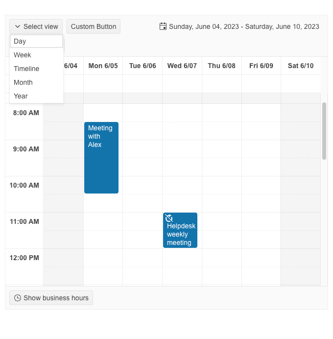
Brand-New Custom Toolbar in Telerik UI for ASP.NET Core Scheduler
The ASP.NET Core Scheduler component now enables you to customize its toolbar via an intuitive configuration option. Whether you want to add new buttons, rearrange existing ones, or customize their appearance, the toolbar configuration option empowers you to easily achieve the desired layout. Simply define the buttons, their order, and the associated functionalities, and the Scheduler component will reflect your custom Toolbar configuration.
See the Telerik UI for ASP.NET Core Scheduler Custom Toolbar demo
Telerik UI for ASP.NET Core DatePicker Enhanced with Autofill Option
Telerik UI for ASP.NET Core DatePicker now supports a convenient autofill option. Upon entering the required day or day and month the component autofills the content with the current month and year or current year, depending on the preliminary entry.
Sortable Functionality Now Supported in Telerik UI for ASP.NET Core TabStrip
Effortlessly sort the Telerik UI for ASP.NET Core TabStrip tabs by dragging and dropping them into the desired position. To enable the sortable functionality simply set the Sortable option to true or add the sortable attribute to the component's tag when using the TagHelper mode.
See the Telerik UI for ASP.NET Core TabStrip sortable tabs demo

Enriching the Telerik UI for ASP.NET Core TimePicker with Focus Specific Time Capability
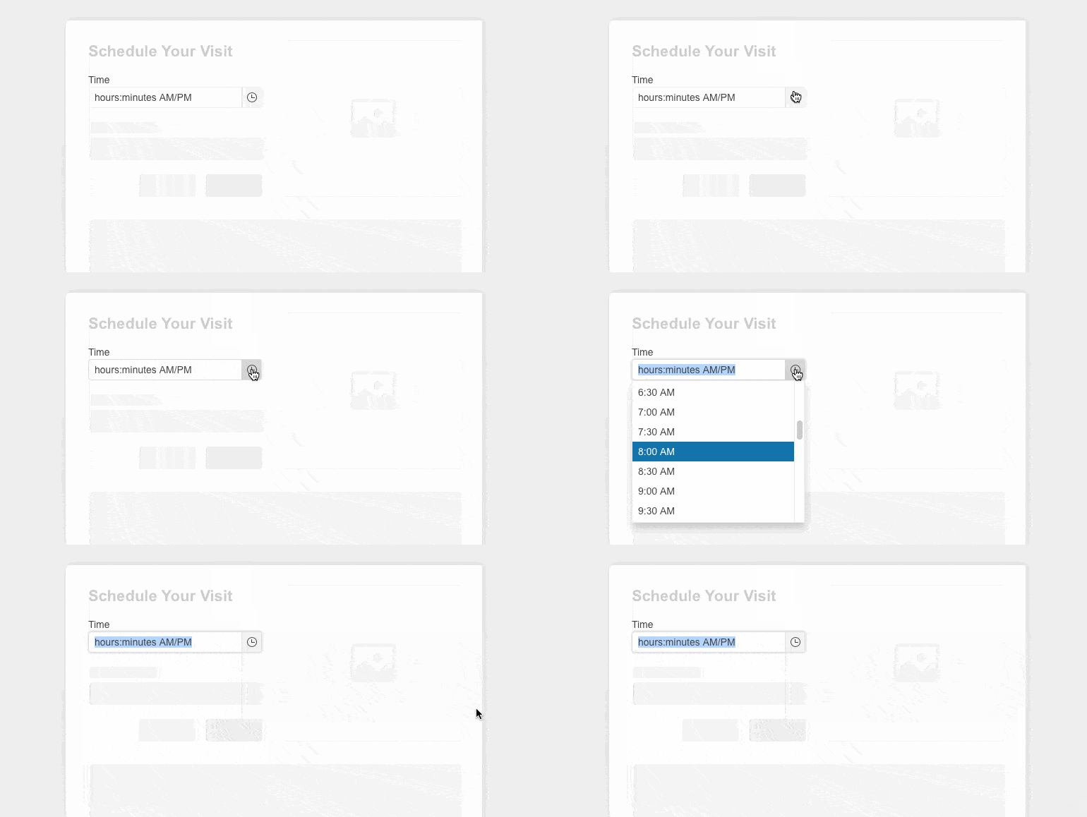
The Telerik UI for ASP.NET Core TimePicker now enables you to define focused time when the time chooser pop-up is opened, thus elevating user interactions even further. The focused time capability provides a convenient way for the user to effortlessly select a highlighted time slot.
See the Telerik UI for ASP.NET Core TimePicker focused time documentation
Redesigned Telerik UI for ASP.NET Core Editor's Table Wizard
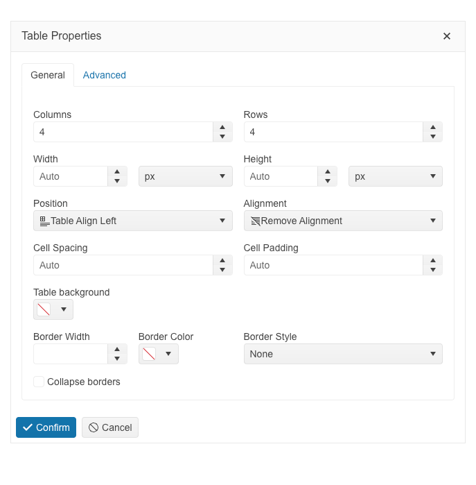
The table configuration wizard in the Telerik UI for ASP.Net Core Editor component has been improved and reorganized into General and Advanced tabs for a more convenient user experience.
The General tab includes table, columns, rows and new granular cell properties, as well as a new table alignment configuration option that provides the possibility for tables to be positioned left, right or center. The Advanced tab of the editor table wizard exposes configurations for id and CSS, as well as accessibility settings for the table caption, header rows and columns.
The cell configuration dialog provides the possibility to configure cell width, height, margins, paddings, borders and more. Users also have a handy option through which they can apply the selected settings either to a specific cell or to all table cells.
See the Telerik UI for ASP.NET Core Editor table wizard documentation
Telerik UI for ASP.NET Core: Compatibility with the Latest .NET 8 Release Candidate (RC)
With the purpose of continuing to provide industry leading support for Microsoft’s newest frameworks and following the evolution of .NET 8, the Telerik UI for ASP.NET Core library now features compatibility with the latest .NET 8 RC. Reap the benefits of .NET 8 RC performance improvements in .NET apps.

WCAG 2.2 Compliant Telerik UI for ASP.NET Core Apps
We continue our efforts to improve the overall accessibility of Telerik UI for ASP.NET Core components, now ensuring compliance with WAI-ARIA, Section 508and WCAG, including the just released WCAG 2.2 standard.
Being compliant with the new WCAG 2.2 standard means that Telerik and Kendo UI products have covered the mandatory requirements for Minimum Target Size and Navigable Guidelines through default theme accessibility swatch and the large size of our components. To meet the Dragging Movement Criteria, we have flexible APIs or built-in functionality. Check out the blog post highlighting what’s new in WCAG 2.2.

Strict Content Security Policy (CSP) Compliance in Telerik UI for ASP.NET Core
One of our goals in 2023 was to improve the Telerik and Kendo UI products quality, theming mechanism and Content Security Policy (CSP) compliance. What strict CSP app settings do is prevent hackers from using HTML injection flaws to force the browser to execute a malicious script. This policy is especially effective against cross-site scripting attacks. Here is what we did so far to ensure strict CSP compliance in Telerik UI for ASP.NET Core:
- With R1 2023, we introduced and started incorporating SVG icons into Telerik and Kendo UI products.
- With R2 2023, we changed the default type of icons in Telerik and Kendo UI libraries and components from font to SVG.
- Now with R3 2023, we’re extracting the Font icons as a separate package and detaching the inline font declaration from the Telerik and Kendo UI themes.
The themes will continue to support both font and SVG icons in components, thus allowing you to decide which type of icons to take advantage of. However, using the font icons will require a separate stylesheet to be referenced by clients.
This third and last step allows us to provide customers with a more secure and efficient icon system and the option to load and reference only needed resources.
Check out the dedicated blog post to find more information on the strategy for improving Telerik and Kendo UI web component libraries by moving from font to SVG icons.
Enhanced Design System Documentation
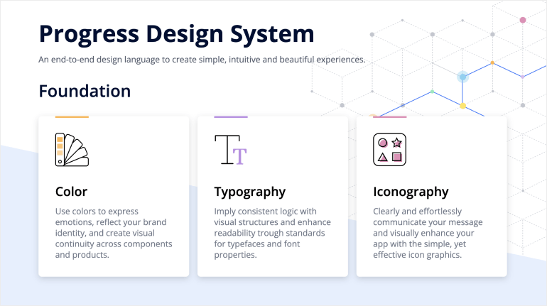
One of the key release items in R2 2023 was the launch of a dedicated Design System documentation site, which offers a wide range of resources, design assets and front-end documentation specifically tailored for the Telerik and Kendo UI libraries. With R3 2023, we have expanded Design System Support by having more components like MultiSelectTree, DateInput, ChipList, Window, Dialog, Editor, ListView, ListBox, MultiColumnComboBox, Filter, etc. meticulously detailed in the Design System documentation.
Our ongoing dedication is to expand this site further, aiming to provide you with all the necessary tools to craft seamless and visually captivating digital experiences and design systems utilizing the power of Telerik and Kendo UI component libraries.
Telerik UI for ASP.NET Core - R3 2023
- Brand-new Telerik UI for ASP.NET Core DockManager Component
- Telerik UI for ASP.NET Core Chart Series Enhanced with a Pyramid Chart
- Introducing DrillDown Support for Telerik UI for ASP.NET Core Charts
- Convenient Context Menu in Telerik UI for ASP.NET Core Grid
- Modernized Experience in Telerik UI for ASP.NET Core Grid
- Brand-New Custom Toolbar in Telerik UI for ASP.NET Core Scheduler
- Telerik UI for ASP.NET Core DatePicker Enhanced with Autofill Option
- Sortable Functionality Now Supported in Telerik UI for ASP.NET Core TabStrip
- Enriching the Telerik UI for ASP.NET Core TimePicker with Focus Specific Time Capability
- Redesigned Telerik UI for ASP.NET Core Editor's Table Wizard
- Telerik UI for ASP.NET Core: Compatibility with the Latest .NET 8 Release Candidate (RC)
- WCAG 2.2 Compliant Telerik UI for ASP.NET Core Apps
- Strict Content Security Policy (CSP) Compliance in Telerik UI for ASP.NET Core
- Enhanced Design System Documentation
New features & Roadmap
Have a feature request?
Post your feedback via the ASP.NET Core UserVoice portal or the Public forums
What's new across all Telerik products?

Next Steps
See Telerik UI for ASP.NET Core in action and check out how much it can do out-of-the-box.
Check out the offers. Purchase an individual suite, or treat yourself to one of our bundles.
Try Telerik UI for ASP.NET Core with dedicated technical support.
