
Telerik UI for ASP.NET MVC
What's New R3 2022
What's New HistoryNew Theme in Telerik UI for ASP.NET MVC: Microsoft Fluent Design System
Telerik UI for ASP.NET MVC gets equipped with the new Microsoft Fluent Design System along with all our .NET and JavaScript web UI components. The Fluent theme follows the official guidelines of the Fluent Design System, enabling you to style ASP.NET MVC components through including the theme into your project. Those of you who already use our Fluent-themed components, can add the Fluent theme to allow any of the other available ASP.NET MVC UI components to seamlessly fit in.
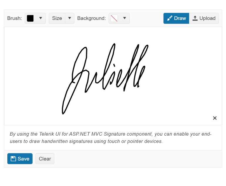
New Telerik UI for ASP.NET MVC Signature Component
The new Telerik UI for ASP.NET MVC Signature component enables end users to draw and place a signature using a mouse or a touch device. The supported use cases include adding a signature as part of a standalone signature application, a web form or an integration with a PDF export. The key features developers can utilize include different canvas options, stroke size and color, background configuration with SVG support, and save as.
See the Telerik UI for ASP.NET MVC Signature Component demo.
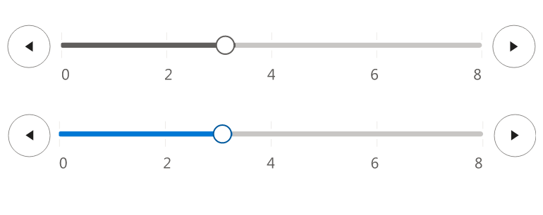
New Telerik UI for ASP.NET MVC SplitButton Component
The new Telerik UI for ASP.NET MVC SplitButton component is an advanced button UI component that allows users to either execute a default button action or choose a secondary command from a related dropdown list. The SplitButton comes with built-in support for icons, multiple sizes, fill mode, theme color, disabling items, RTL support, keyboard navigation, accessibility and multiple UI customization options.
See the UI for ASP.NET MVC SplitButton UI component demo.

CDN Licensing for Telerik UI for MVC
The way Telerik UI for ASP.NET MVC is licensed undergoes an important change in this release. R3 2022 introduces the requirement to add a license key whenever using the CDN to reference any Kendo UI for jQuery JavaScript and CSS files. Although the license key mechanism will not break any builds, it serves as a verification step, acknowledging that you a licensed user. Applying a license key will be as simple as adding a single line of code to your project(s).
New Telerik UI for ASP.NET MVC DropDownButton Component
The new Telerik UI for ASP.NET MVC DropDownButton component renders a button that opens a list of action items. The DropDown Button component supports embedding icons and images within its items, advanced functionality like data binding, RTL support, keyboard navigation and accessibility, as well as multiple appearance customization options for the component as a whole and for each of its items.
See the UI for ASP.NET MVC DropDownButton UI component demo.

Telerik UI for ASP.NET MVC API Improvements
The quality of the ASP.NET MVC API documentation is a success factor for anyone who needs to reference it. That is why this release introduces first steps into improving the API methods documentation by adding descriptions and examples for some of the most widely utilized ASP.NET MVC components. You will find improved API documentation for the DataGrid, DropDownList, Date Picker, DateRange Picker, Data Source, and Window. We will continue with the UI for ASP.NET MVC API improvements throughout 2023.
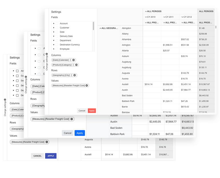
MVC PivotGrid v2 Local Data Binding
The local binding feature allows you to populate the ASP.NET MVC PivotGrid v2 with local flat data. When the component is configured for local binding, it will serialize the data as part of its data source and will perform all data operations on the client.
Accessibility Improvements in Telerik UI for ASP.NET MVC
Compliance with the latest accessibility standards is a big focus for Telerik UI for ASP.NET MVC as it is for all our Telerik and Kendo UI component libraries. Beyond updating our components to comply with Section 508, WCAG 2.1, and WAI-ARIA standards, R3 2022 introduces accessibility-specific demos that can be used to test any of our MVC UI components with screen readers and other software used to test software for accessibility. Anyone that needs to run accessibility tests on any Telerik UI for ASP.NET MVC component, can do so by visiting a public URL, without the help of a developer.
The accessibility improvements apply to following Telerik UI for ASP.NET MVC: Data Grid, TreeList, TreeView, PanelBar, Stepper, Wizard, Pager, DateInput, Calendar, DateRangePicker, DatePicker, TimePicker, DateTimePicker, Drawer and Breadcrumb.

Telerik UI for ASP.NET MVC Data Grid
The UI for ASP.NET MVC Data Grid UX improvements include adding a configuration option for enabling/disabling column menu as well as grouping, sorting and deleting enhancements.
Enable/Disable Column Menu on a Per-Column Basis
Enabling and disabling column menu is now available out-of-the-box on a per-column basis, mimicking the behavior of enabling/disabling sorting or filtering and ensuring consistency across all Grid configuration options.
Hide Currently Grouped Column
Another ASP.NET MVC Data Grid feature added in R3 2022 is the option to hide the column or field which is currently being grouped. Previously every time a column was grouped, the column would always be displayed which was not ideal for all the Grid use cases. The new option to hide columns/fields that are being used for grouping ensures flexibility for the ASP.NET MVC developers and smoother experience for the end user.
Default Sort Direction
Default initial sort direction for grid columns is now also available, saving the cumbersome efforts for setting direction for each column individually. On initial sort (first click for sorting), you can override the default column ascending order and set it to descending. The respective property is called InitialSortDirection and can be used on a Data Grid and Column Level.
New Document Processing Libraries' (DPL) features
With R3 2022, we’ve released new features across all Document Processing libraries to support you better navigate your document formats:
New WordProcessing features:Page Numbering fields: Although the field codes are supported, we have now added a functionality that allows you to update the PAGE, PAGEREF, NUMPAGES and SECTIONPAGES fields and easily calculate their result.
See the docs for WordProcessing Page Numbering Fields
Shapes support: The shapes feature allows you to easily insert or interact with existing shapes like circles, boxes, arrows and many others directly in your documents. You can style the inserted shapes by using gradient fills and various patterns outlines, as well as change the size of the shapes and rotate them.
See the docs for WordProcessing Shapes support
New in SpreadProcessing: Repeat specific rows or columns on every printed page: This feature allows you to specify a row or a column that will be repeated on every printed page.
See the docs for SpreadProcessing: Repeat specific rows or columns on every printed page
New in PdfProcessing: PdfProcessing Signature flags support: With this new functionality, you can specify that there is a signature, even if the signature itself does not have a visual representation.
Export PDF pages to images: We have added the ability to convert the pages of a .pdf document to images. This feature will work with the .NET Standard version and does not depend on any Windows libraries.
See the docs for PDFProcessing: Export PDF pages to images
New in SpreadStreamProcessing: SpreadStreamProcessing import: This functionality allows you to read large XLSX or CSV files without loading the entire document in memory. This improves the memory footprint and the performance compared to the RadSpreadProcessing library.
See the docs for SpreadStreamProcessing: SpreadStreamProcessing Import

Fire 'Change' Event Only When Row Select and Deselect are Performed within Multiple ASP.NET MVC Components
This update applies to scenarios when the select functionality of the ASP.NET MVC Components, affected by the change, is used, implying that the 'Change' event will only fire when a row is selected or unselected. This is behavior alternate to the event firing anytime an interaction occurs and applies to following ASP.NET MVC components – Grid, Calendar, MultiViewCalendar, Listbox, ListView, TreeList, FileManager, Gantt.
Telerik UI for ASP.NET MVC - R3 2022
- New Theme in Telerik UI for ASP.NET MVC: Microsoft Fluent Design System
- New Telerik UI for ASP.NET MVC Signature Component
- New Telerik UI for ASP.NET MVC SplitButton Component
- CDN Licensing for Telerik UI for MVC
- New Telerik UI for ASP.NET MVC DropDownButton Component
- Telerik UI for ASP.NET MVC API Improvements
- MVC PivotGrid v2 Local Data Binding
- Accessibility Improvements in Telerik UI for ASP.NET MVC
- Telerik UI for ASP.NET MVC Data Grid
- New Document Processing Libraries' (DPL) features
- Fire 'Change' Event Only When Row Select and Deselect are Performed within Multiple ASP.NET MVC Components
New features & Roadmap
Have a feature request?
Post your feedback via the ASP.NET MVC UserVoice portal or the Public forums
What's new across all Telerik products?

Next Steps
See UI for ASP.NET MVC in action and check out how much it can do out-of-the-box.
Check out the offers. Purchase an individual suite, or treat yourself to one of our bundles.
Try UI for ASP.NET MVC with dedicated technical support.


