Elevate Your .NET MAUI Apps: Theming Support Now Available!

Summarize with AI:
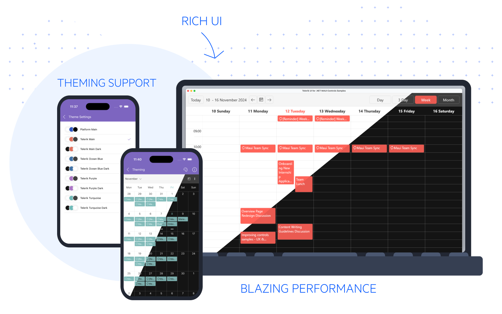
Learn how to theme your apps in minutes with the new Telerik UI for .NET MAUI built-in theming mechanism. Coming in hot with lots of color swatches and total ability for customization!
Hello, hello! For those who have read my blogs, you know this is not the first time I am going to talk about today’s topic. Yet, this is the first time that I will be talking about it on the MAUI shores, but I am not scared. Today’s theme is theming. Themes are an inevitable part of any modern app’s aesthetics and supporting it is a must for enhancing both UI and UX.
That is why I am more than excited to share with you the greatest news of the Progress Telerik UI 2024 Q4 Release: Telerik UI for .NET MAUI now offers a built-in theme with some fancy light and dark swatches to explore and enjoy! And I know I am your best choice to help get started with it, so let’s not waste another minute and dive right in.

Intro to Telerik .NET MAUI Themes and Swatches
If you are already familiar with .NET MAUI’s official guide on how to theme an app, then you will certainly feel like a natural with Telerik UI for .NET MAUI’s theming mechanism. Like Microsoft’s guide, our themes practically represent a collection of styles and templates in XAML files, which determine the appearance of the Telerik .NET MAUI components.
I also mentioned that our themes provide numerous fancy swatches which represent a color variation of a theme. All swatches of a given theme use the same fonts, sizes and layouts. On the other hand, the colors of texts, backgrounds and borders are different.
All colors of a swatch are consumed through DynamicResource and are available for you to use in parts of your app that aren’t Telerik components. Nice, huh? This will surely help you achieve consistent look and feel to the tiniest bit of your .NET MAUI app.
Enough theory. Time for some practice.
How to Turn On Telerik .NET MAUI Theming
If you already have an app that is configured to use the Telerik UI for .NET MAUI components, then adding Telerik theming to it will take only a few steps. If not, don’t worry—we have articles on how to do it for both Visual Studio and Visual Studio Code.
Ready for a short step-by-step guide? I promise the steps are quick and easy to follow.
First, go to the .csproj file and add the following to it:
<PropertyGroup>
    <UseTelerikTheming>true</UseTelerikTheming>
</PropertyGroup>
After that, rebuild the app to generate the TelerikTheming folder containing all the styles and resources needed for the Telerik .NET MAUI controls.
The TelerikTheming folder contains one of the most important resources which has to be added to the App.xaml file of your app as a next step—the TelerikTheming resource dictionary:
<Application.Resources>
    <ResourceDictionary>
        <ResourceDictionary.MergedDictionaries>
            <ResourceDictionary Source="Resources/Styles/Colors.xaml" />
            <ResourceDictionary Source="Resources/Styles/Styles.xaml" />
            <local:TelerikTheming />
        </ResourceDictionary.MergedDictionaries>
    </ResourceDictionary>
</Application.Resources>
Finally, set the Telerik theme and one of its color variations inside the App.xaml.cs file:
var telerikTheming = Application.Current.Resources.MergedDictionaries.OfType<TelerikTheming>().Single();
telerikTheming.Theme = TelerikTheming.Themes.Single(t => t.Theme == "Telerik" && t.Swatch == "Ocean Blue");
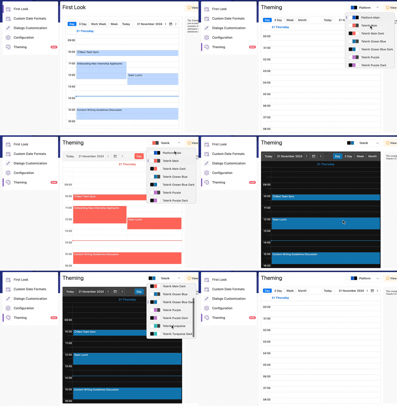
And that’s it! Our app now has a Telerik theme with its Ocean Blue swatch applied. Which reminds me, I forgot to mention all of the 8 predefined swatches for both light and dark that the Telerik .NET MAUI theme comes with—Main, Main Dark, Ocean Blue, Ocean Blue Dark, Purple, Purple Dark, Turquoise and Turquoise Dark.
In case I missed something else that might be of importance to you, be sure to check the online documentation on that matter.
Before hitting F5, I suggest we bring a simple scenario to our app and to save some time. I decided to add the Telerik UI for .NET MAUI Visual Studio Code extension and add some predefined page templates with login, register and reset password screens. It turned out pretty fast and easy—I just followed the Add The Scaffolding Page section.
Of course, I couldn’t help myself and touch the frontend a little to use the DynamicResources from the theme and swatch I chose, but will not flood you with the code. I also registered some routes and connected the dots between them in the respective ViewModels:
public AppShell()
{
    InitializeComponent();

    Routing.RegisterRoute("login", typeof(TelerikLoginPage));
    Routing.RegisterRoute("register", typeof(TelerikRegisterPage));
    Routing.RegisterRoute("resetpassword", typeof(TelerikResetPasswordPage));
}

public class TelerikLoginPageViewModel : NotifyPropertyChangedBase
{
    // Omitted code here ...

    private async void ExecuteForgotPassword(object obj)
    {
        await Shell.Current.GoToAsync("resetpassword");
    }

    private async void ExecuteSingUp(object obj)
    {
        await Shell.Current.GoToAsync("register");
    }
}
The Star of the Show
Ready for a debut? I say F5 it! ▶️

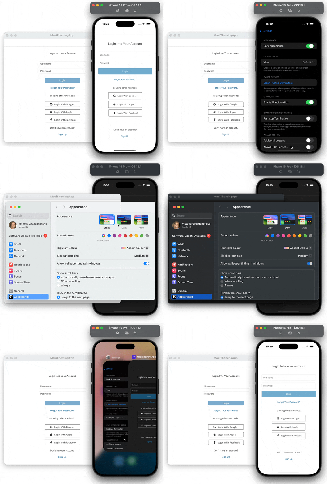
I know that some people prefer to use only dark. Others—only light mode. And there are also people who like to use some apps in light and others in dark. This decision is strongly personal, yet it is good to have the ability to make it. I personally think that it is a must for your app to respond to system theme changes; however, one of the most-used options is to be able to switch between light and dark modes within the app. Follow me to the next section where I will show you how to do both with our themes.
Turning the Lights On and Off
For this section, the promise I need to keep is to show how to respond to system changes. And then how to put the control in the user’s hands.
Respond to System Theme Changes
This part requires subscribing to the RequestedThemeChanged event of our app, which will be done in the constructor. For more convenience (and to help myself for the next part), I also created a ThemeHelper that will handle the actual theme change.
public static class ThemeHelper
{
    public static void ChangeTheme(string themeName)
    {
        Application.Current!.Resources.MergedDictionaries.OfType<TelerikTheming>().Single()
            .Theme = TelerikTheming.Themes.Single(t => t.FullName == themeName);
    }
}

public App()
{
    InitializeComponent();

    Application.Current.RequestedThemeChanged += (s, e) => ThemeHelper.ChangeTheme(e.RequestedTheme == AppTheme.Dark ? "Telerik Ocean Blue Dark" : "Telerik Ocean Blue");
    ThemeHelper.ChangeTheme(Application.Current.RequestedTheme == AppTheme.Dark ? "Telerik Ocean Blue Dark" : "Telerik Ocean Blue");
}
Let’s see the result:

Switch Between Light/Dark Within the App
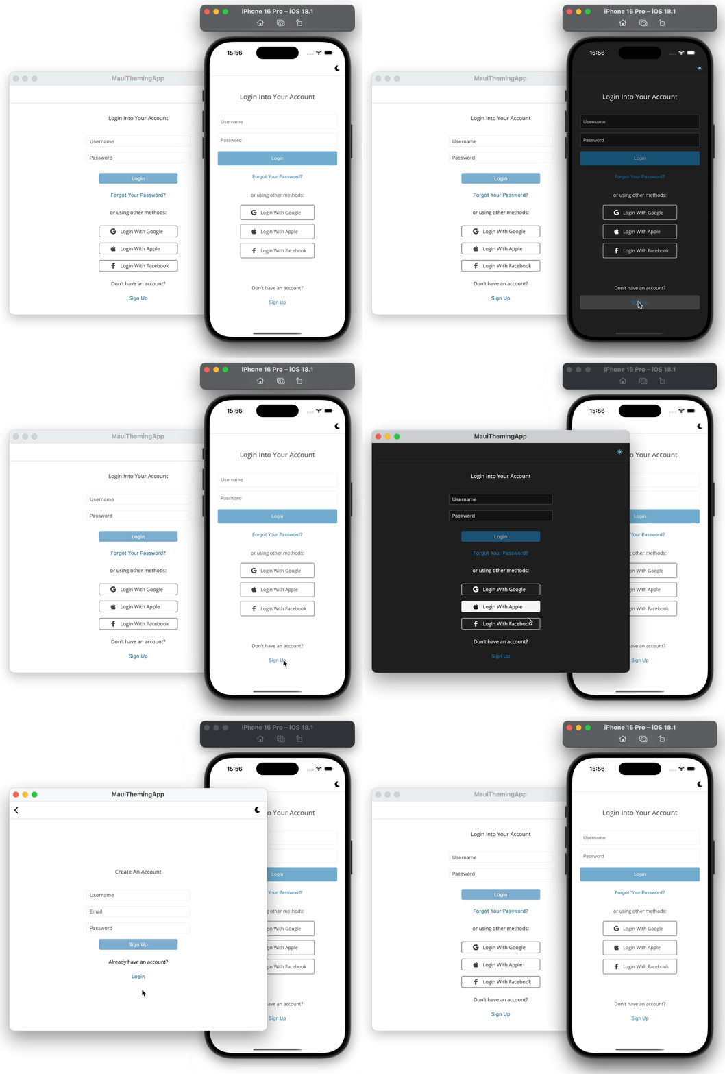
This is the part where a button or something should be added through which the user will be given the ability to determine the mode of the app themselves. For this purpose, I chose to add a ToolbarItem that will change its IconImageSource based on the mode. I also created a common ThemableContentPage which will take care of this and serve as a base class for all my pages.
When the user clicks the toolbar item, this is what happens:
switchThemeToolbarItem.Clicked += (s, e) =>
{
    Application.Current.UserAppTheme = Application.Current.RequestedTheme == AppTheme.Light ? AppTheme.Dark : AppTheme.Light;
};
And on RequestedThemeChanged like in the previous subsection, the ChangeTheme method of the ThemeHelper is called, and also the icon of the toolbar item is updated:
switchThemeToolbarItem.IconImageSource = new FontImageSource() { FontFamily = "Glyphs", Size = 16, Glyph = Application.Current.RequestedTheme == AppTheme.Dark ? "\ue901" : "\ue900" };Let’s give it a go:

Lovely. 💓
A Lot More to Explore
All these login, register and reset password screens contain only a tiny but essential bit of an app’s building blocks, i.e., inputs (represented by Entry) and buttons (represented by TemplatedButton). There are many other components that I believe deserve your attention and are all showcased .NET MAUI samples apps. Simply choose your favorite from the All Controls list and go to its Theming example.

There is one more thing that I did not show you, as I believe the information is already a lot, and will leave to you to explore at your own pace—the ability to customize themes. This is also well documented and covered with examples in the Customizing a Theme article.
Keep Growing
A thousand thanks to all of you who reached that part and read my blog! I hope it left you eager to discover master theme management within your stunning .NET MAUI apps. And stay tuned as the built-in Telerik UI for .NET MAUI theme and its swatches are currently in preview, so there is a lot more to come in the next releases. 😊
Do not forget to also check the latest additions to the Telerik UI for .NET MAUI’s growing 60+ members family that are guaranteed to help you meet all cross-platform app requirements for data handling, performance, UX, design and so much more.
If by some chance you aren’t already using the .NET MAUI library, you can try it out completely free for 30 days! Give it a shot and enjoy just how easy and fast it makes it to develop .NET MAUI masterpieces.

Viktoria Grozdancheva
Viktoria is a Senior Front-end Developer with 5+ years of experience designing and building modern UI for desktop and mobile platforms on Microsoft/Telerik technology stacks. Her spare time is dedicated to friends and family and discovering new pieces of the world. Find her on Twitter and LinkedIn.

