Exploring the TitleBar in .NET MAUI

Summarize with AI:
Learn how to customize your Windows app’s TitleBar with .NET MAUI.
The freedom to choose the colors that define you, the shoes you love or that hairstyle that makes you feel incredibly comfortable are unique expressions of your personality. The same goes for applications: The more customization options we have, the better we can adapt them to the needs of users, giving them that unique touch that makes them both special and functional.
In this article, I’ll teach you how to customize the TitleBar of your Windows applications using .NET MAUI. Take advantage of this knowledge to deliver an increasingly memorable and personalized user experience.
What Is a TitleBar?
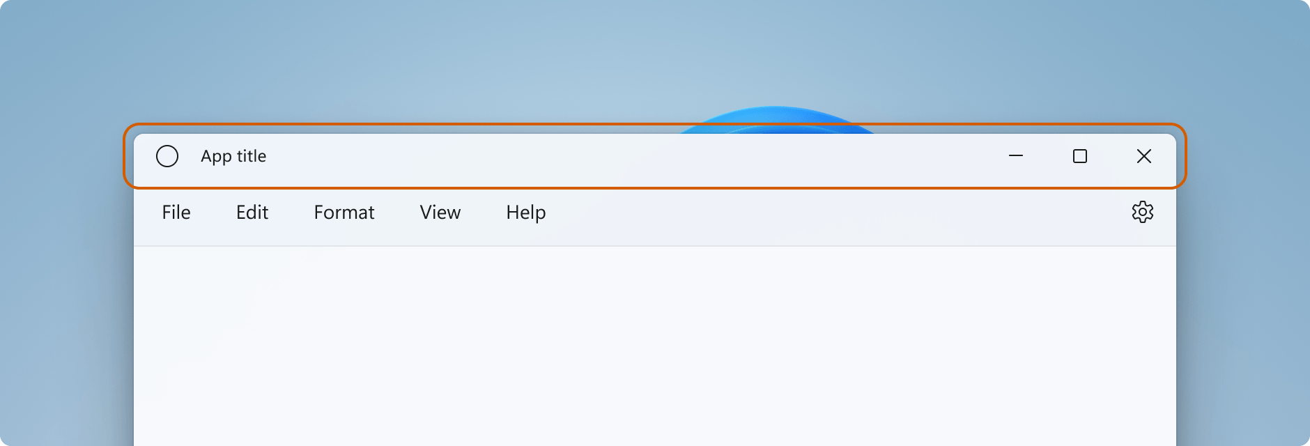
In case you don’t know, the TitleBar is a horizontal bar located at the top of an application. Its main purpose is to serve as the window’s header, and it’s easily recognizable because it contains the buttons to close, minimize and maximize the window.

Image obtained from the official documentation.
TitleBar Properties
In .NET MAUI, you can customize the TitleBar to add a unique touch and enhance your application’s personality. In this session, I will show you the available properties to use and present a visual diagram that clearly indicates where each one is located in the TitleBar.

Let’s take a look at each one of these properties:
- Icon: The icon located on the left side, with dimensions set to a default size of 16x16 pixels. Type: ImageSource. (Optional parameter.)
- Title: The title of the bar, typically the name of the app. Type: string.
- Subtitle: The subtitle of the bar, usually providing additional information related to the app’s title. Type: string.
- Leading Content: The content that will be displayed before the icon in the TitleBar. Being of type IView, it allows adding any element that implements this interface (such as a Label, Button, etc.) to be used. Type: IView.
- Trailing Content: The control that is displayed after the Content control in the TitleBar. In other words, it is the content that appears to the right of the central area of the title bar (after the main content). Type: IView.
- Content: The element displayed in the center of the TitleBar. This content is placed between the “Leading” content (which is before the icon) and the “Trailing” content. Type: IView.
Let’s explore some additional properties that can enhance the look and feel of your application:
- ForegroundColor: This property is used to define the color for both the title and subtitle of the TitleBar. Type: Color.
- DefaultTemplate: It is the base design or structure used to render the TitleBar by default. If the appearance of the TitleBar is not modified, the DefaultTemplate will be used. Type: ControlTemplate.
- PassthroughElements: This property allows you to define a list of elements in the interface (such as buttons, labels, etc.) that are not affected by the “drag” behavior. In other words, if the user tries to click and drag from one of these elements, instead of moving the window, these elements will directly handle the actions programmed for them. Type:
IList<IView>.
💡 To Keep in Mind
- The default and standard height of the TitleBar is 32 pixels, but it can be customized. Find more detailed information on the measurements of its components and other valuable design insights here.
- The properties mentioned above can all be styled and used for data bindings, except for the Default Template and Passthrough Elements.
- Views assigned to the Content, LeadingContent and TrailingContent properties will prevent any interaction with the TitleBar area, as they will take control of all input in that region.
How to Create the Titlebar
Now that you’re familiar with the properties for customizing your TitleBar, let’s dive into the implementation! In this example, the TitleBar will feature a title and subtitle on the left, a search bar in the center and a button on the right.
<TitleBar Title="Food App" Subtitle="Preview" BackgroundColor="#9fc5e8ff">
  <TitleBar.Content>
    <SearchBar Placeholder="Search"
    MaximumWidthRequest="300"
    HorizontalOptions="FillAndExpand"
    VerticalOptions="Center" />
  </TitleBar.Content>
  <TitleBar.TrailingContent>
    <Button Text="LR" BackgroundColor="Blue" Margin="0,10"/>
  </TitleBar.TrailingContent>
</TitleBar>
Code Explanation
Open the
<TitleBar>tags and add the Title and Subtitle. Inside these tags, include all the elements that will be part of the TitleBar.<TitleBar.Content>: If you want to include a visual element in the content area, simply place it inside the<TitleBar.Content>tags. In this example, a SearchBar is used.<TitleBar.TrailingContent>and<TitleBar.LeadingContent>: Similar to<TitleBar.Content>, these sections allow you to add visual elements to their respective areas. Use<TitleBar.TrailingContent>for the content on the right side and<TitleBar.LeadingContent>for the content on the left side. In the example, we have just added an element for the TrailingContent.
The Result
The code from the previous example will allow you to create a TitleBar similar to the one shown below:

🗒️ Important: You can hide the TitleBar by setting the IsVisible property to false. When this happens, the entire window content will be displayed in the area previously occupied by the TitleBar.
TitleBar Visual States
The TitleBar also includes several visual states that you can use, making state management even easier. If you’re not familiar with visual states, as stated in the official documentation, “Visual State Manager provides a structured way to make visual changes in the UI from the code.” If this is your first time reading about this, I encourage you to check out Microsoft’s visual states page.
Below, I’ll show you the available visual states for the TitleBar:

Adding the visual status is very simple. Below, I provide an example code snippet taken from the official documentation. In this case, the visual states TitleBarTitleActive and TitleBarTitleInactive, from the list mentioned above, are used to adjust the BackgroundColor property. The background color changes dynamically depending on whether the TitleBar is active or inactive.
<TitleBar ...>
  <VisualStateManager.VisualStateGroups>
    <VisualStateGroupList>
      <VisualStateGroup x:Name="TitleActiveStates">
        <VisualState x:Name="TitleBarTitleActive">
          <VisualState.Setters>
            <Setter Property="BackgroundColor" Value="Blue" />
          </VisualState.Setters>
        </VisualState>
        <VisualState x:Name="TitleBarTitleInactive">
          <VisualState.Setters>
            <Setter Property="BackgroundColor" Value="Pink" />
          </VisualState.Setters>
        </VisualState>
      </VisualStateGroup>
    </VisualStateGroupList>
  </VisualStateManager.VisualStateGroups>
</TitleBar>
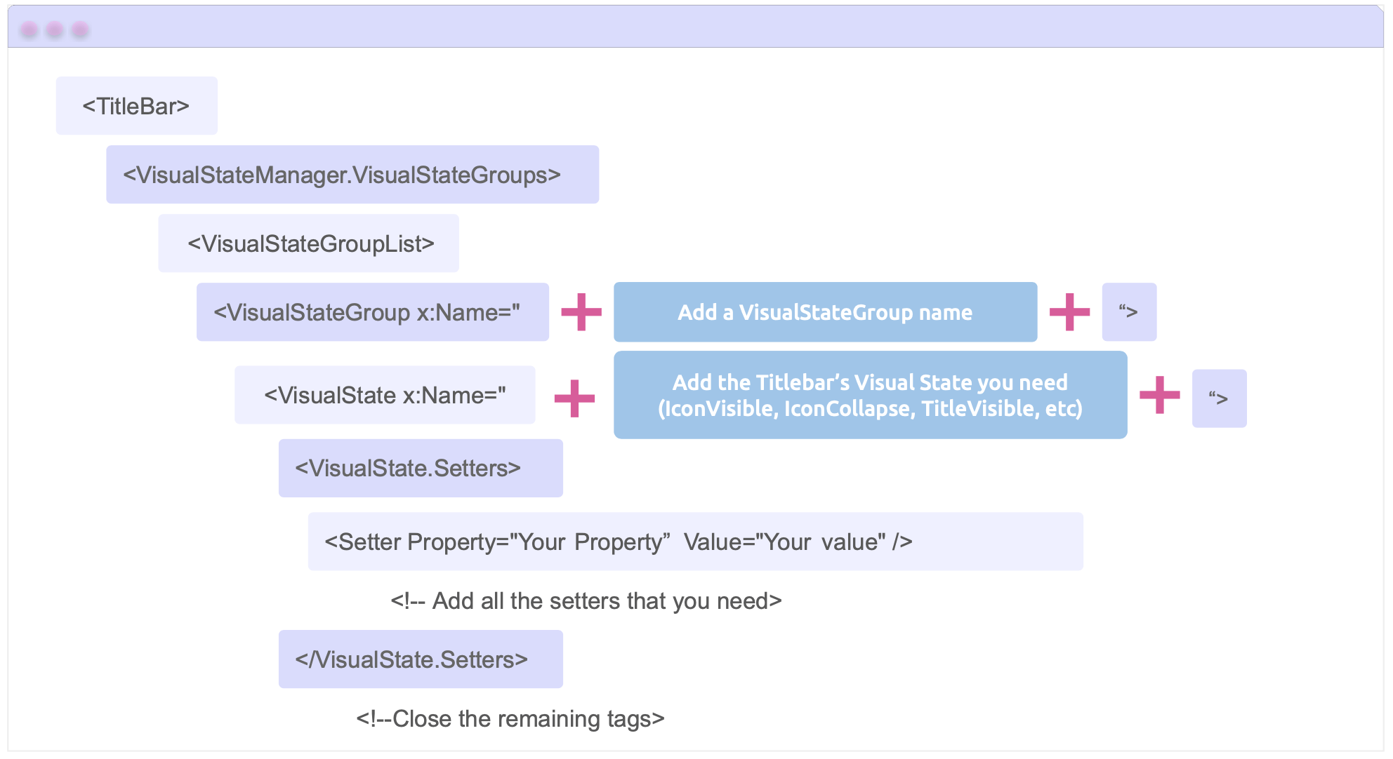
Additionally, I include the structure with a brief explanation of how to configure the visual state that you required:

🚫 Limitations
➖ The TitleBar is currently only available on Windows, with support for Mac Catalyst expected in a future release.
References
This article was based on the official documentation:

Leomaris Reyes
Leomaris Reyes is a software engineer from the Dominican Republic specializing in mobile development. She is a 7-time Microsoft MVP and actively builds mobile applications while sharing practical knowledge through technical articles and developer-focused content.
Through her work, she explains programming concepts, developer tools and real-world development practices to help developers grow in their careers.
You can follow her on Instagram and TikTok at @leomarisreyes.dev, read her articles on AskXammy, and connect with her on LinkedIn, where she shares tutorials, insights and resources for developers.

