
5 Tips for Creating Responsive UIs with Telerik UI for ASP.NET Controls

Summarize with AI:
Further improve the already responsive grid and chart from Telerik UI for ASP.NET Core so users can make the most of your app whatever their device.
The reality is that the users for any web app that you create are going to want to view it on multiple platforms. We can even quantify that: It’s going to be more platforms than you have the time or money to test on, let alone tweak the UI for. As a result, you want a set of UI controls that will “do the right thing” out of the box which, fortunately, the Progress Telerik UI for ASP.NET Core controls pretty much do.
But I’ve got five tips here (four for the Kendo-Grid and one for the Kendo-Chart) to help make your UI even more responsive. The good news here is that none of these tips will take you more than a minute to implement.
Well-Behaved vs. Problem Controls
I’m concentrating on the grid and chart for good reason. In practice, individually, most controls (textboxes, buttons, dropdown lists, etc.) fit fine into a narrow screen.
The problem controls are the “wide” controls—the grids and the chart, for example. That’s not to say the ASP.NET Core Grid and ASP.NET Core Chart controls ignore how they’re being displayed. The grid automatically adjusts the displayed columns to fit the available screen space (and lets the user scroll horizontally with a finger flick to see any columns that don’t appear on the screen).
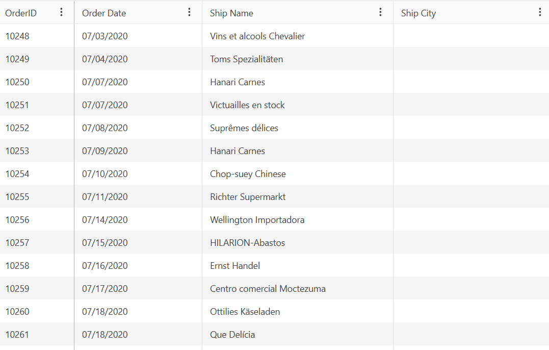
Here, for example, is the grid in a browser on a full-sized screen:
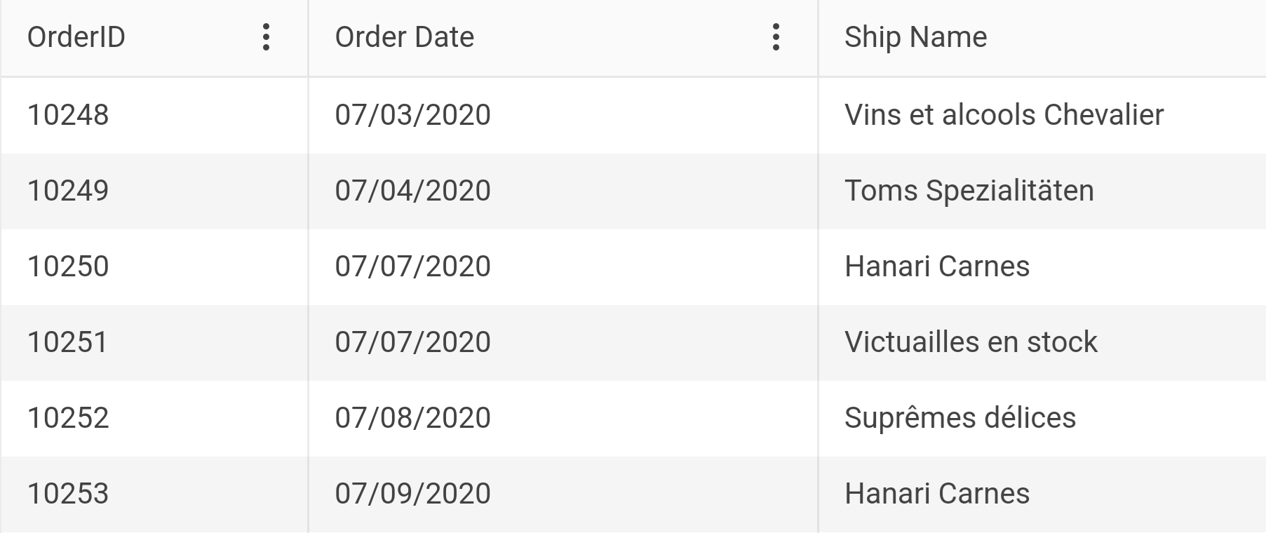
And here it is on a smartphone:
The chart is equally responsive. It automatically sizes to fill the space you’ve allotted to it (which is what you want). You may be happy with both of these controls in every environment that your users view them.
However, in the grid, horizontal scrolling can create problems for your users as columns your user needs for reference (otherwise known as “the first columns on the left”) scroll off the screen. And, while “in-place editing” in a row works well on a big screen, on a small screen (i.e., your smartphone) in-place editing can be … awkward.
And, while the chart automatically sizes to fill the space available to it, the chart doesn’t resize if the user changes the size of their browser window or, on their smartphone, switches from portrait to landscape mode.
So here are my tips for dealing with that: four for the grid and one for the chart. You can find the Razor TagHelper version of this grid right here.
Tip 1: Locking Grid Columns
With the grid, you can specify one or more columns to always appear on the left side of the grid by just by setting the column’s locked attribute to “true”:
<column field="OrderID" locked="true" width="120" />
Locked columns have one limitation: They must be the first columns on the left side of the grid (but, then, those are probably the columns you want to keep on the page, anyway). That means that if you want to lock the second column in the grid, you must also lock the first column.
Tip 2: Sticky Grid Columns
Sticky columns are more flexible than locked columns because you can flag any column anywhere in the grid as a sticky column. When the grid is first displayed, if the sticky column is visible, it will appear in its normal position. If the sticky column isn’t visible (i.e., the column is off the screen to the right), then the column will appear anyway, stuck to the right side of the grid.
When your user scrolls horizontally, a sticky column will scroll normally across the screen. If the column was already stuck to the right hand edge of the grid then, when the column would normally scroll onto the screen, the column will “unstick” itself from the grid’s edge and scroll, as normal, to the left. When a sticky column gets to the other side of the grid, it will stick to that side and stay on the screen as the user continues to scroll the other columns.
Enabling a sticky column is just as easy as enabling a locked column. Just set the column’s sticky attribute to true:
<column field="OrderID" locked="true" width="120" />
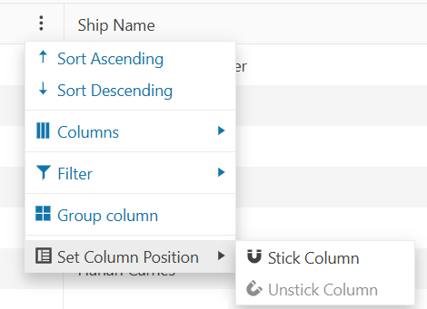
Tip 3: Stickable Grid Columns
I’ve saved my favorite column tip for the last: It’s not always obvious to me what columns my users will want to be “sticky,” so I’ve given up trying. Instead, I let my users pick the columns they want to stick by:
- Setting one or more columns’
stickableattribute to true - Enabling the grid’s column menu by adding the
column-menuelement below thecolumnsclosing tag and setting itsenabledattribute to true
Now, with the stickable option and the column menu enabled, when my users click on the column menu, they get to pick which columns they want to stay on the screen.
I think the sensible solution for fitting your grid into any screen is to mark your grid’s first column as locked, then mark all the other columns in the grid as stickable, and, finally, enable the column menu. That means that a typical grid for me looks like this:
    <columns>
        <column field="OrderID"  locked="true" width="120" />
        <column field="OrderDate"  stickable=”true” title="Order Date" width="200"
                                                                                                       format="{0:MM/dd/yyyy}" />
        <column field="ShipName" stickable="true" title="Ship Name" width="300" />
        …more columns…
</columns>
<column-menu enabled="true"/>
Tip 4: Grid Editing
If you want to let your user edit a row in your grid and find the experience on a smartphone is less than optimal, then you can provide an editing panel that will pop up whenever a user clicks a row’s edit button. To implement that, all you have to do is add the editable tag with its mode attribute set to “popup” to your grid. I put that tag just before my grid’s closing tag:
   <editable mode="popup"/>
</kendo-grid>
And, as long as you’re doing that, set the keno-grid element’s adaptive-mode attribute to AdaptiveMode.Auto to have all of the grid’s editing UIs adapt to whatever device the grid is being displayed on:
<kendo-grid name="grid"
            adaptive-mode="AdaptiveMode.Auto"
            navigatable="true"
            selectable="single,row"
            height="550">
It makes sense to me to just make both of these changes to every grid that supports editing.
Tip 5: Chart Resize
Finally, a tip about the other “wide” control, the Kendo-Chart.
If you’d like to support resizing the chart as the space available to the chart changes, you just need to add three lines of boilerplate JavaScript code to your page. This JavaScript code will resize the chart that has its name attribute set to “chart” so that chart always takes up 100% of the space available to it every time the window size changes:
<script>
$(window).on('resize', function () {
    $("#chart").css("width", "100%")
                .data("kendoChart").resize();
        });
</script>
Like adding the stickable attribute to every column element in the Kendo-Grid or setting the editable mode of a grid to popup, I think adding this code to every page displaying a chart is a smart move.
And there’s five things you can do to make your wide controls easier for your users to work with, even in a narrow screen (and none of these tips will take you longer than a minute to implement).
Ready to try Telerik UI for ASP.NET Core?

Peter Vogel
Peter Vogel is both the author of the Coding Azure series and the instructor for Coding Azure in the Classroom. Peter’s company provides full-stack development from UX design through object modeling to database design. Peter holds multiple certifications in Azure administration, architecture, development and security and is a Microsoft Certified Trainer.
Related Posts
Comments
All articles
Topics
Web MobileMobile
Desktop
Design
Productivity
People
