background cover
background cover

Telerik UI for ASP.NET Core

Roadmap


What's Coming in 2026?

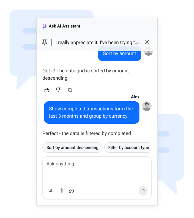
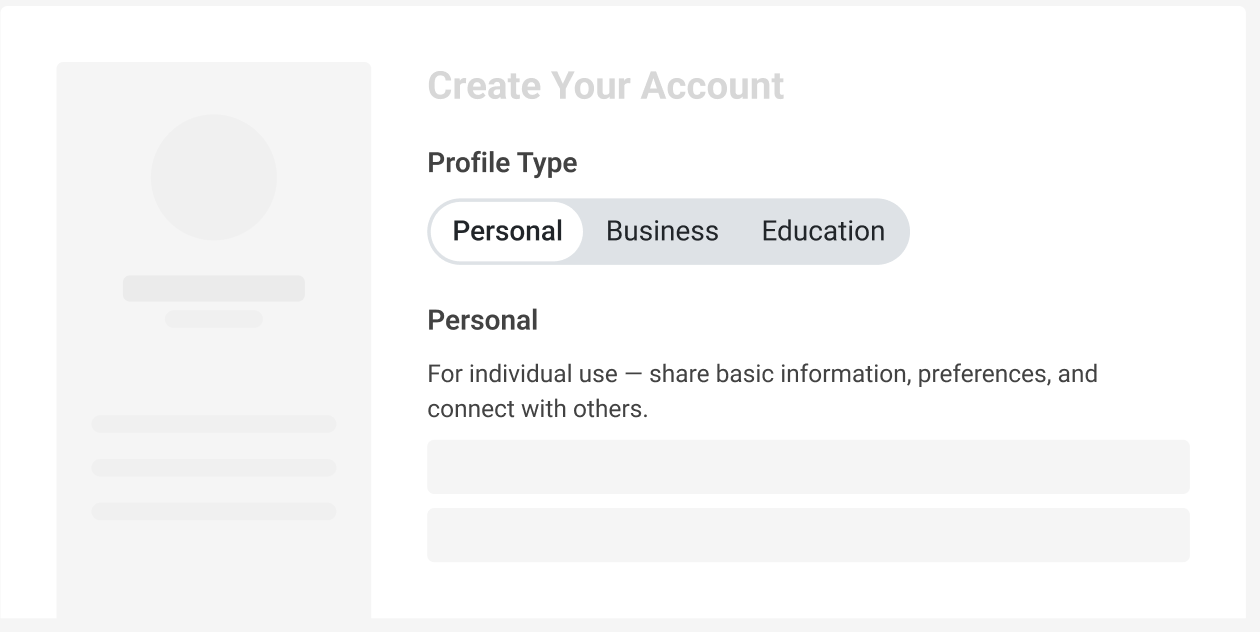
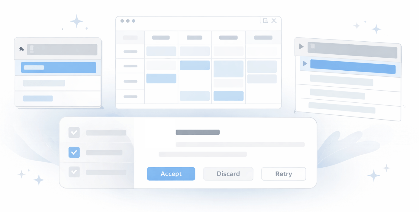
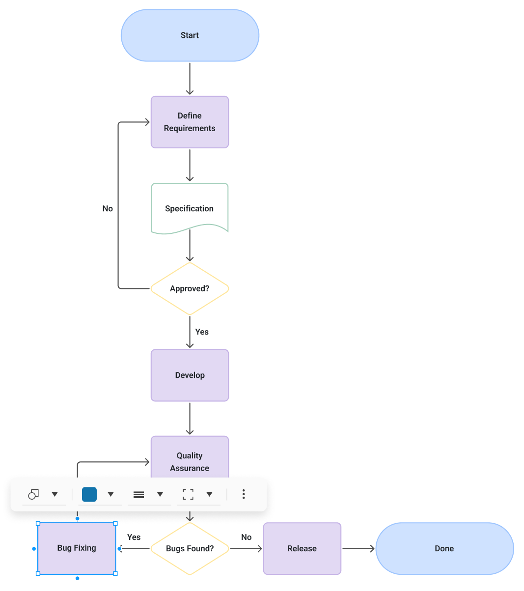
Discover what’s coming to Telerik UI for ASP.NET Core in 2026. Our next roadmap introduces powerful AI-driven agents and assistants, new ASP.NET Core UI components and feature upgrades, and performance improvements - everything you need to build modern, intelligent, high-performance web applications with confidence.

We remain committed to a consistent release cadence and to shaping the library together with you. Explore what’s planned, share your ideas, and stay ahead with the latest innovations in web application development.


Telerik UI for ASP.NET Core

Grid Sticky Group Headers

New feature

We are enhancing the Grid with sticky group headers to improve context and readability when working with large grouped datasets. As users scroll vertically, the active group header will remain visible at the top of the Grid until the next group replaces it, ensuring clear orientation within the data. The feature will integrate seamlessly with existing grouping behavior, pinned rows, virtualization, and all other Grid capabilities.


thumbnail

Grid CSV Export

New feature
We are adding built-in CSV export support to the Grid, enabling users to quickly download and share data in a widely supported, lightweight format. The feature will allow exporting current grid data while respecting applied sorting, filtering, and grouping settings.


Chat Component Improvements

Improvement

The Chat component continues to evolve as our go-to interface for both human-to-human and human-to-AI communication. Following major updates in 2025 and Q1 2026, we’re further enhancing its UI/UX and expanding its feature set to deliver a smoother, more reliable messaging experience. Upcoming improvements include quality-of-life additions such as message virtualization, FixedScroll mode for a better experience with long messages, failed message state with resend option, and many other usability features. These enhancements ensure the Chat component remains intuitive, modern, and ready for advanced conversational scenarios across your applications.

thumbnail

Segmented Control

New component

We plan to introduce a Segmented Control for Telerik UI for ASP.NET Core to make it easier for users to choose between a small set of related options in a compact, modern UI.

Planned capabilities include:

  • Single- and multi-select modes for toggling between one or several options

  • Content templates to display text, icons, or both in each segment

  • Responsive layouts that adapt gracefully on desktop and mobile

  • Built-in theming and customization to align with your brand and design system

  • Easy data binding and form integration so it works seamlessly with existing Blazor forms and validation

The goal is to offer a lightweight, intuitive alternative to radio buttons and button groups for common selection scenarios.

thumbnail

Default Telerik and Kendo UI Theme Modernization

Improvement

We are evolving the Kendo UI Default theme to deliver a more modern and refined visual design language while preserving full backward compatibility. This initiative focuses on refreshing the overall aesthetic, improving design system modularity for greater flexibility and scalability, and enhancing AI/LLM friendliness to better support emerging intelligent experiences. The result will be a cleaner, more adaptable, and future-ready theme that builds on the strengths of the existing Default design.


thumbnail

Component UI/UX Enhancements

Improvement

Our UI components already deliver strong functionality and reliability, and we are continuously investing in making them even better. As part of our ongoing improvement efforts, we are launching a broader initiative to further modernize and refine key components across the portfolio—enhancing visual polish, usability, and extensibility while building an even stronger foundation for future innovation.

Upcoming enhancements include a more streamlined and contextual Inline AI Prompt experience, refinements to the Menu component to align with modern interaction patterns, and a refreshed Scheduler designed to support extensibility and future capabilities such as SmartBox.

These improvements are part of a wider evolution of the suite, and additional components will continue to be enhanced as we elevate the overall experience to an even higher standard.


thumbnail

Grid Row Pinning

New feature

We are introducing built-in row pinning functionality in the Grid, allowing users to pin important rows so they remain visible while scrolling. This enhancement improves usability and data comparison in large datasets, ensuring key records stay in focus during horizontal navigation. The feature will be fully integrated, work seamlessly with virtualization, and support persistence of pinned rows within the data model.


New Grid Grouping Modes

New feature

We’re introducing new grouping modes in the Grid to provide greater flexibility, improved data density, and clearer hierarchy visualization - while fully preserving backward compatibility.

What’s Coming

  • Compact Grouping
    A more space-efficient version of the current layout that removes unnecessary blank spacing for improved readability and higher data density.

  • Single-Column Grouping
    Displays all grouping levels in one dedicated column with indentation to represent hierarchy — ideal for compact, consolidated views.

  • Multi-Column Grouping
    Shows each grouping level in its own column, improving clarity and scanability for complex datasets.

  • Classic Grouping (Preserved)
    The existing grouping mode remains fully supported with some visual improvements and no breaking changes.


Customizable Keyboard Shortcuts

New feature

Keyboard navigation is essential for power users, accessibility, and high-throughput workflows. In 2026, we plan to introduce configurable keyboard shortcuts for the Grid in Telerik UI for ASP.NET MVC.

You will be able to:

  • Customize default shortcuts for common actions (for example, navigation, selection, editing, opening menus)

  • Define component-specific shortcut schemes that match your users’ expectations

  • Centralize shortcut configuration, so it is easier to document and maintain across large applications

This work builds on our existing keyboard support, focusing on giving you control rather than a fixed, one-size-fits-all setup.

Agentic UI Generator

New feature

Аn intelligent, prompt-driven assistant that accelerates building modern web applications with Telerik and Kendo UI. Developers can generate complete, production-ready UI layouts using natural language, from creating any single UI element to assembling full pages with routes, layouts, and themes. The generator integrates seamlessly with AI-powered IDEs and works with any connected LLM through the Telerik/Kendo UI MCP Servers that provide rich product context for higher-quality outputs. This capability boosts productivity and enables teams to deliver polished enterprise-grade UIs significantly 


thumbnail

Diagram Component Enhancement

New feature

Throughout the year we will deliver continuous updates to the Diagram component, introducing new editing capabilities, improved interactions, and refreshed visuals. Key additions include:

  • Connector text support with flexible positioning
  • Tooltips for nodes and connectors
  • Shape and connector content text editing
  • Floating toolbar enabling quick shape and connector editing and reshaping

The updates will also strengthen core diagramming behavior with improved connection points, refined connector logic, and enhanced shape interactions. These upgrades enable more straightforward, intuitive, and efficient end-user diagram operation.


thumbnail

Enhanced Charts Interactivity and Motions

Improvement

We’re making Telerik UI for ASP.NET Core even more engaging and visually appealing. Upcoming updates include improved chart animations for smoother transitions, category highlighting for better data focus and readability, and theme-driven animation tokens to ensure consistent motion design across all themes. These enhancements will help you create charts that not only convey data clearly but also deliver a polished, modern user experience aligned with your application’s design.


Refined Appearance System for Theme-Controlled Defaults

Improvement

We’re introducing a more flexible and consistent way to manage component appearance across all Telerik & Kendo UI themes. Starting in Q1 2026, components will rely on theme-controlled defaults for key appearance options such as Fill Mode, Theme Color, Rounded Corners, and Size. This update gives you the best of both worlds—modern, theme-aligned designs out of the box, plus the flexibility to tailor components to your exact needs.

  • Cleaner, theme-driven styling: Themes will define the default look and feel for a more cohesive design experience.
  • Full customization remains: You can still override any default by explicitly setting component API options.
  • Consistent behavior across themes: A unified system ensures predictable styling and easier maintenance.
  • Clear hierarchy of control: Theme defaults → Component API overrides → Runtime customization.

Support for .NET 11

Improvement

Telerik UI for ASP.NET Core will provide full support for the upcoming .NET 11 previews and the official .NET 11 version. Our team is committed to delivering day-zero compatibility, ensuring a smooth experience as you explore the latest runtime advancements. In addition to maintaining seamless functionality, we are actively evaluating how to take advantage of the new features and performance improvements in .NET 11 to bring even greater value to your applications.

Multiple Components Enhancements

New feature

We closely monitor your suggestions, and based on your feedback, we will implement gradual improvements to our existing components. Keep an eye on future improvements to the Grid, Scheduler, Chart, TabStrip, Menu components, and many others.

Accessibility Improvements

Improvement

In our upcoming 2025 releases, we will continue with our efforts to improve the overall accessibility of Telerik UI for ASP.NET Core components, ensuring the highest level of compliance with WAI-ARIA, Section 508, and the latest WCAG standards.

thumbnail

No items found.

Get Started Waves

Next Steps

Launch demos

See Telerik UI for ASP.NET Core in action and check out how much it can do out-of-the-box.

Compare pricing

Check out the offers. Purchase an individual suite, or treat yourself to one of our bundles.

Download Free Trial

Try Telerik UI for ASP.NET Core with dedicated technical support.