
Getting Started with the .NET MAUI GridSplitter Control

Summarize with AI:
The .NET MAUI GridSplitter control allows users to redistribute space between the rows and columns of a Grid to enhance the user experience and customization. Learn how to implement the GridSplitter from Telerik UI for .NET MAUI.
In this article, we will analyze the new .NET MAUI GridSplitter control, which is part of the Progress Telerik UI for .NET MAUI controls suite. Let’s get started!
What Is the GridSplitter Control?
The GridSplitter control allows your users to redistribute space between the rows and columns of a Grid. This is useful when you want to provide the ability to adjust the layout of your pages, enhancing user experience and customization.
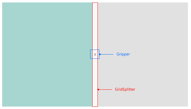
The GridSplitter control is composed of a Gripper indicator and a GridSplitter, as shown below:
Let’s explore some use cases for the GridSplitter control below.
What Are Some Use Cases for a GridSplitter Control?
Using the GridSplitter control can be highly beneficial in interfaces where your users might want to optimize the space of certain sections in your app by resizing them. One use case could be in an app with a sidebar menu that you’d like to make resizable, either smaller or larger.
Another use case could be an app that displays master-detail information, allowing the display of a product’s information on one side and its details on another. You could also use a GridSplitter in graphic applications, like a drawing app with a section containing the canvas for sketches and another section with drawing tools or properties for elements on the canvas.
In this article, we will walk you through how you can implement a GridSplitter in a Markdown text editor app, where one section allows you to write Markdown code, and the other provides a preview of the rendered content.
Creating a Markdown Text Editor App
Let’s create a Markdown text editor app with real-time preview. This will be achieved easily thanks to the .NET MAUI RichTextEditor control, which supports rendering HTML content natively. Now, you might wonder why we’d render HTML when what we actually want to preview is Markdown. The answer is that we will convert Markdown code into HTML, which simplifies the task.
To create this app, follow these steps:
- Create a project using the .NET MAUI app template and leave the Include sample content option unchecked.
- Follow the installation guide to set up Telerik UI controls in your .NET MAUI project.
- Install the
MarkdigNuGet package, which allows the conversion of Markdown code into HTML. - Also install the
CommunityToolkit.Mvvmpackage for building clean ViewModels quickly. - Replace the contents of MainPage.xaml with the following:
    <Grid RowDefinitions="*,*">
        <Grid Margin="10" RowDefinitions=".1*,.9*">
            <Label Text="Live Preview:" VerticalOptions="Center" />
            <Border Grid.Row="1" StrokeThickness="2">
                <telerik:RadRichTextEditor x:Name="richTextEditor" Source="{Binding HtmlContent}" />
            </Border>
        </Grid>

        <Grid
            Grid.Row="1"
            Margin="10"
            RowDefinitions=".1*,.9*">
            <Label Text="Markdown Editor:" VerticalOptions="Center" />
            <Border Grid.Row="1" Margin="0,10,0,10">
                <Editor Text="{Binding MarkdownText}" AutoSize="Disabled" HeightRequest="300"/>
            </Border>
        </Grid>
    </Grid>
- Create a file called
MainViewModel.csand replace its content with the following code:
public partial class MainViewModel : ObservableObject
{
    [ObservableProperty]
    string markdownText;
    [ObservableProperty]
    string htmlContent;

    partial void OnMarkdownTextChanged(string value)
    {
        var result = Markdown.ToHtml(value);
        HtmlContent = result;
        Console.WriteLine(result);
    }
}
- In
MainPage.xaml.cs, replace the content with the following:
public partial class MainPage : ContentPage
{
    public MainPage()
    {
        InitializeComponent();
        BindingContext = new MainViewModel();
    }
}
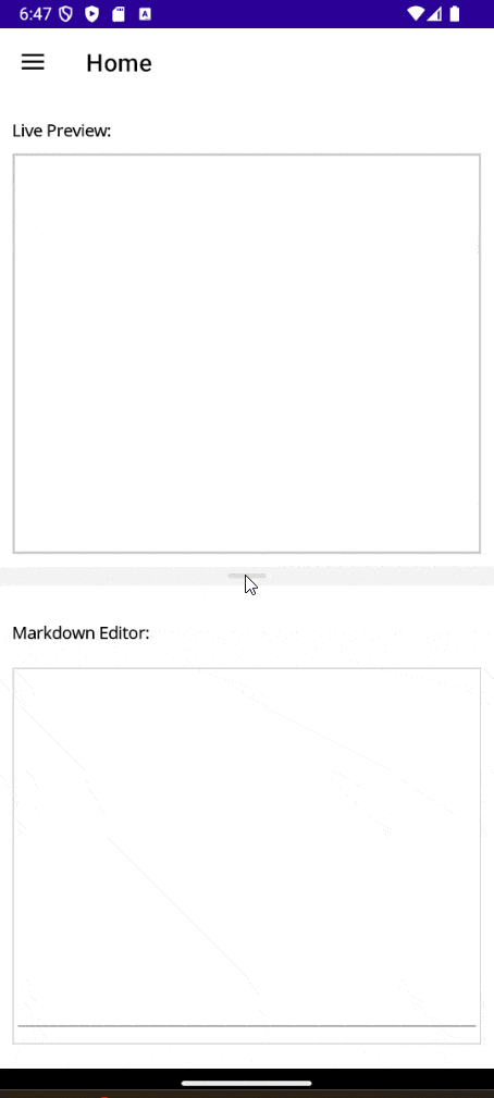
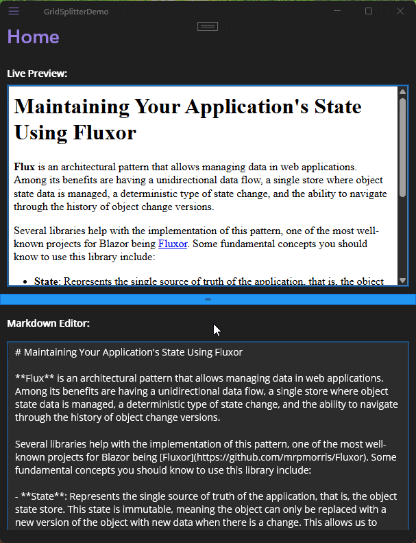
With these changes applied, you will have a fully functional app that allows real-time Markdown code preview, as seen below:

The app is fully functional, but it would greatly help users to resize the Markdown editor section as well as the content previewer section, making this scenario an excellent candidate for adding a GridSplitter.
Adding a GridSplitter to the Project
To add a GridSplitter control, we need to consider adding an extra row or column to the Grid that contains it during the design. For example, our application currently has two rows in the main Grid. It would be ideal to create an additional row between the two sections to accommodate the GridSplitter, which can then be dragged to resize one section or the other. Knowing this, we can modify the MainPage.xaml file as follows:
<ContentPage
    ...
    xmlns:telerik="http://schemas.telerik.com/2022/xaml/maui">

    <Grid RowDefinitions="*,Auto,*">
        <Grid...>
            ...
        </Grid>
        <telerik:RadGridSplitter
            Grid.Row="1"
            HorizontalOptions="Fill"
            VerticalOptions="Start" />
        <Grid...>
            ...
        </Grid>
    </Grid>

</ContentPage>
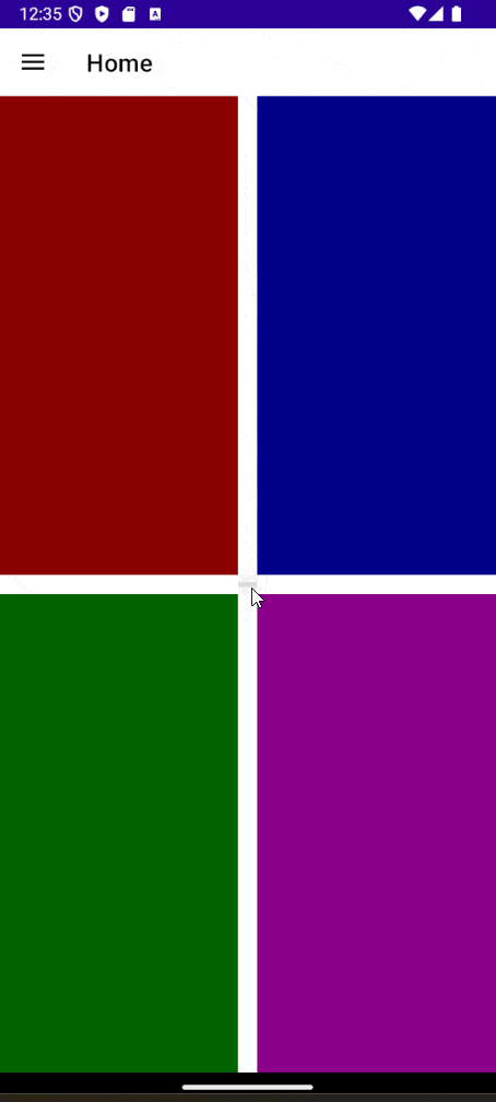
Once this is done, we will see that the GridSplitter control has been added, and we can use it to change the row sizes in the application:
Although the control has appeared in the user interface, the behavior is not as expected. To solve this, let’s look at the properties that allow us to configure the GridSplitter.
Configuring the GridSplitter Control via ResizeDirection
There are two properties that allow us to modify the GridSplitter behavior. First, ResizeDirection is used to indicate whether we want the user to be able to resize rows or columns. The possible values we can assign include Auto (default), Columns and Rows.
For example, suppose you have the following user interface:
<Grid ColumnDefinitions="*,Auto,*" RowDefinitions="*,Auto,*">

    <telerik:RadGridSplitter
        x:Name="splitter"
        Grid.Row="1"
        Grid.Column="1" />

    <Grid BackgroundColor="DarkRed" />
    <Grid Grid.Column="2" BackgroundColor="DarkBlue" />
    <Grid Grid.Row="2" BackgroundColor="DarkGreen" />
    <Grid
        Grid.Row="2"
        Grid.Column="2"
        BackgroundColor="DarkMagenta" />
</Grid>
If you assign the value Columns to ResizeDirection, we can see that the columns of the containing Grid can be resized, but not the rows:
On the other hand, if we assign a value of Rows to ResizeDirection, we can resize the rows, but not the columns:

The default value for ResizeDirection is Auto, which automatically determines whether to allow row or column resizing based on the HorizontalOptions and VerticalOptions properties, as well as the width compared to the height.
Configuring the GridSplitter Control via ResizeBehavior
The second property we can configure for the GridSplitter in terms of behavior is ResizeBehavior. This property is used to control how rows and columns behave when resizing occurs. This property accepts values from the GridResizeBehavior enumeration, with the following possible values:
CurrentAndNext: Resizes the current and next row or column, i.e., the row or column where theGridSplitteris located and the next row or column.PreviousAndCurrent: Resizes the previous and current row or column, i.e., the row or column where theGridSplitteris located and the previous row or column.PreviousAndNext: Resizes the previous and next row or column, i.e., the row or column before theGridSplitterlocation and the next row or column.BasedOnAlignment: This is the default value, which automatically determines which rows or columns are resized based on their alignment, using the values ofHorizontalAlignmentandVerticalAlignment.
In our example application, as we want both the Markdown code editor area and the previewer to be resizable, we will apply the value PreviousAndNext as follows:
<telerik:RadGridSplitter
    Grid.Row="1"
    HorizontalOptions="Fill"
    ResizeBehavior="PreviousAndNext"
    VerticalOptions="Start" />
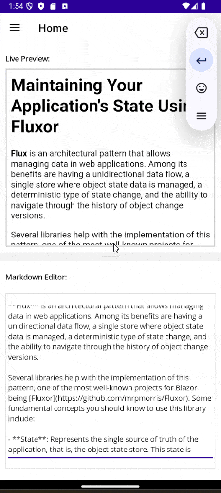
This will produce the following behavior:
Styling the .NET MAUI GridSplitter
The GridSplitter control offers several properties that allow you to customize it to match your application’s branding. The properties that can assist with this include BackgroundColor, Background, BorderColor, BorderBrush, BorderThickness, CornerRadius and ContentPadding. Additionally, you can change the gripper color using the GripperColor property.
You can also use the above properties in conjunction with the Visual States Normal, MouseOver and Disabled to further enhance the user experience, as shown in the following example:
<Grid RowDefinitions="*,Auto,*">
    <Grid.Resources>
        <Style TargetType="telerik:RadGridSplitter">
            <Setter Property="BackgroundColor" Value="#2196F3" />
            <Setter Property="Background" Value="#2196F3" />
            <Setter Property="BorderColor" Value="#1976D2" />
            <Setter Property="BorderBrush" Value="#1976D2" />
            <Setter Property="BorderThickness" Value="1" />
            <Setter Property="CornerRadius" Value="0" />
            <Setter Property="ContentPadding" Value="2" />
            <Setter Property="VisualStateManager.VisualStateGroups">
                <VisualStateGroupList>
                    <VisualStateGroup x:Name="CommonStates">
                        <VisualState x:Name="Normal">
                            <VisualState.Setters>
                                <Setter Property="BackgroundColor" Value="#2196F3" />
                                <Setter Property="Background" Value="#2196F3" />
                                <Setter Property="BorderColor" Value="#1976D2" />
                                <Setter Property="BorderBrush" Value="#1976D2" />
                                <Setter Property="BorderThickness" Value="1" />
                                <Setter Property="CornerRadius" Value="0" />
                                <Setter Property="ContentPadding" Value="2" />
                            </VisualState.Setters>
                        </VisualState>
                        <VisualState x:Name="MouseOver">
                            <VisualState.Setters>
                                <Setter Property="BackgroundColor" Value="#9C27B0" />
                                <Setter Property="Background" Value="#AB47BC" />
                                <Setter Property="BorderColor" Value="#7B1FA2" />
                                <Setter Property="BorderBrush" Value="#7B1FA2" />
                                <Setter Property="BorderThickness" Value="3" />
                                <Setter Property="CornerRadius" Value="8" />
                                <Setter Property="ContentPadding" Value="10" />
                            </VisualState.Setters>
                        </VisualState>
                        <VisualState x:Name="Disabled">
                            <VisualState.Setters>
                                <Setter Property="BackgroundColor" Value="#424242" />
                                <Setter Property="Background" Value="#616161" />
                                <Setter Property="BorderColor" Value="#757575" />
                                <Setter Property="BorderBrush" Value="#757575" />
                                <Setter Property="BorderThickness" Value="2" />
                                <Setter Property="CornerRadius" Value="4" />
                                <Setter Property="ContentPadding" Value="5" />
                            </VisualState.Setters>
                        </VisualState>
                    </VisualStateGroup>
                </VisualStateGroupList>
            </Setter>
        </Style>
    </Grid.Resources>

    <Grid Margin="10" RowDefinitions=".1*,.9*">
        <Label
            FontAttributes="Bold"
            Text="Live Preview:"
            TextColor="White"
            VerticalOptions="Center" />
        <Border
            Grid.Row="1"
            Stroke="#1976D2"
            StrokeThickness="2">
            <telerik:RadRichTextEditor x:Name="richTextEditor" Source="{Binding HtmlContent}" />
        </Border>
    </Grid>

    <telerik:RadGridSplitter
        Grid.Row="1"
        HorizontalOptions="Fill"
        IsEnabled="False"
        ResizeBehavior="PreviousAndNext"
        VerticalOptions="Start" />

    <Grid
        Grid.Row="2"
        Margin="10"
        RowDefinitions=".1*,.9*">
        <Label
            FontAttributes="Bold"
            Text="Markdown Editor:"
            TextColor="White"
            VerticalOptions="Center" />
        <Border
            Grid.Row="1"
            Margin="0,10,0,10"
            Stroke="#1976D2">
            <Editor
                AutoSize="Disabled"
                BackgroundColor="#2C2C2C"
                HeightRequest="300"
                Text="{Binding MarkdownText}"
                TextColor="White" />
        </Border>
    </Grid>
</Grid>
In the previous code, I’ve intentionally assigned completely different values to each Visual State so that you can more easily see them when running the application:
You can see that bluish colors represent a Normal state, purple colors indicate a MouseOver state and, finally, grayish colors represent a Disabled state.
Conclusion
Throughout this article, you’ve learned what the Telerik GridSplitter control is, some of its use cases and, most importantly, how to implement it in your own applications to allow users to easily resize sections within your app. Now it’s time for you to explore use cases in your own applications for its usage.

Héctor Pérez
Héctor Pérez is a Microsoft MVP with more than 10 years of experience in software development. He is an independent consultant, working with business and government clients to achieve their goals. Additionally, he is an author of books and an instructor at El Camino Dev and Devs School.
Comments
All articles
Topics
Web MobileMobile
Desktop
Design
Productivity
People
