Improving Your Navigation Accessibility: 4 Quick Tips

Summarize with AI:
Any one of these four improvements to your app’s navigation would vastly advance its accessibility. See them in practice within an Angular app.
Accessibility (a11y) is a crucial part of web development, allowing your app to be usable by all, including people with disabilities. One of the most impactful places to start improving accessibility is navigation—the doorway and hallways of your application. If users can’t move through your app effectively (or at all), the rest of your content doesn’t matter.
In this article, I’ll cover a few key improvements you can make to enhance keyboard and screen reader accessibility, improve contrast and provide better user state identification in your navigation. While these examples are shown in an Angular app, the principles apply to any framework—the implementation is the only thing that changes.
Some accessibility updates are now required by the European Accessibility Act. Learn more.
1. Improve Active Link Identification for Clear Navigation
Using RouterLinkActive & AriaCurrentWhenActive
Many users rely on visual cues to understand where they are in an application—but not all users can see those cues. If an active link is only styled visually (e.g., with color), screen reader users won’t have a clear indication of their location, and users with low vision or color blindness may struggle to differentiate between active and inactive links.
To make navigation clearer for everyone, we need to:
✅ Visually indicate the active page (e.g., bold text, underlines or high contrast)
✅ Programmatically indicate the active page so assistive technologies can announce it
Step 1.1: Setting Up Routes in Angular
Before we start, we need to define our routes. In modern Angular, routes are typically defined in a routes.ts file and provided via provideRouter() in app.config.ts.
routes.ts
import {Routes} from '@angular/router';
import {HomeComponent} from './home/home.component';
import {UserComponent} from './user/user.component';
import { ShopComponent } from './shop/shop.component';
export const routes: Routes = [
  { path: '', title: 'App Home Page', component: HomeComponent },
  { path: 'home', title: 'Home Page', component: HomeComponent },
  { path: 'user', title: 'User Page', component: UserComponent },
  { path: 'shop', title: 'Shop Page', component: ShopComponent },
];
app.config.ts
import {ApplicationConfig} from '@angular/core';
import {provideRouter} from '@angular/router';
import {routes} from './app.routes';
export const appConfig: ApplicationConfig = {
  providers: [provideRouter(routes)],
};
Step 1.2. Adding Navigation with Active Styling
Next, we’ll create a simple navigation menu with routerLink to connect each route and a <router-outlet> to display the active route’s content.
⚠️ Heads up! Don’t forget to import
RouterLinkinto your navigation component. If you skip this, your links may fail silently.
app.component.ts
import { Component } from '@angular/core';
import { RouterOutlet, RouterLink } from '@angular/router';

@Component({
  selector: 'app-root',
  template: `
    <nav>
      <a routerLink="home">Home</a>
      <a routerLink="user">User</a>
      <a routerLink="shop">Shop</a>
    </nav>
    <router-outlet />
  `,
  imports: [RouterOutlet, RouterLink],
})
export class AppComponent {}
We have working routes but we need to style it properly for better visibility. Let’s use routerLinkActive to give each anchor an special CSS class, indicating which anchor is currently active.
Step 1.3: Give the Active Link an Active Indicator
app.component.ts (Adding Active Styling)
import { Component } from '@angular/core';
import { RouterOutlet, RouterLink, RouterLinkActive } from '@angular/router';
@Component({
  selector: 'app-root',
  template: `
    <nav>
      <a routerLink="home" routerLinkActive="active-page">Home</a>
      <a routerLink="user" routerLinkActive="active-page">User</a>
      <a routerLink="shop" routerLinkActive="active-page">Shop</a>
    </nav>
    <router-outlet />
  `,
  imports: [RouterOutlet, RouterLink, RouterLinkActive],
})
export class AppComponent {}
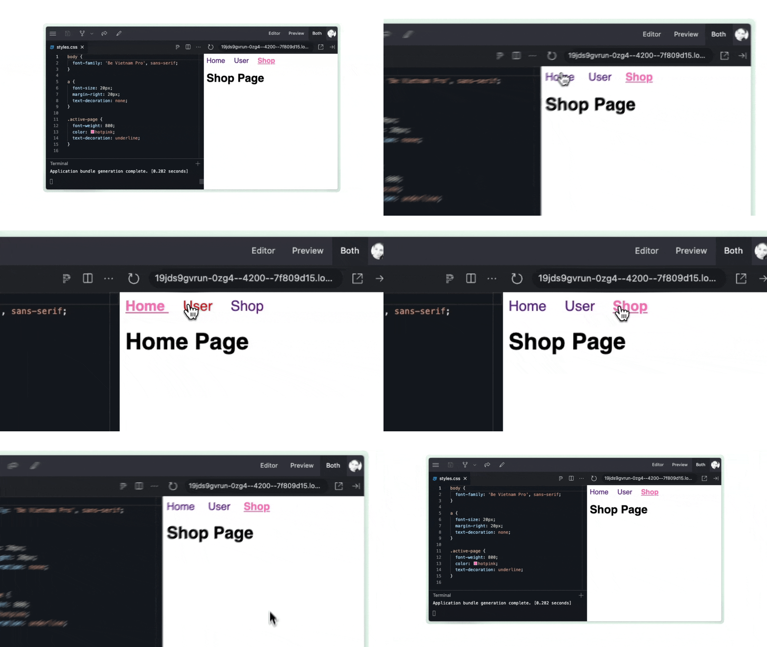
At this point, Angular will dynamically apply the active-page class when a link is active. Now, let’s add some CSS to make it visually clear.
Step 1.4: Styling the Active Link
CSS (either in your component file or an external one, your choice)
.active-page {
  font-weight: 800; //bold would also work
  text-decoration: underline;
  color: hotpink;
}
So here, we are giving the active link a CSS class of active-page and then adding styles to that class name in our css file:

✅ Now, users can clearly see which page is active.
🚨 But we still have an issue: This solution only benefits sighted users. Screen readers still can’t tell which link is active—which we’ll fix next.
📝 Summary of improvements so far:
✔️ Active links now have clear visual indicators (bold + underline, as well as color)
✔️ Keyboard users can navigate links properly
✔️ Still missing: A way for screen readers to recognize the active link (we’ll fix that next!)
2. Making Active Links Accessible with ariaCurrentWhenActive
While visual indicators like color, bold text and underlining help sighted users, screen readers need additional context. The RouterLinkActive directive allows us to set an aria-current attribute using ariaCurrentWhenActive. This tells assistive technologies which link represents the active page, improving the navigation experience for non-visual users. (Some screen readers will even announce what you set this value to. More on this later.)
So, to recap:
🔹 Sighted users benefit from bold text and underlines, but screen reader users need more context.
🔹 The RouterLinkActive directive helps visually, but it doesn’t provide semantic meaning for assistive technologies.
🔹 Solution: Use aria-current to programmatically identify the active page.
app.component.ts updated!
import { Component } from '@angular/core';
import { RouterOutlet, RouterLink, RouterLinkActive } from '@angular/router';
@Component({
  selector: 'app-root',
  template: `
    <nav>
      <a routerLink="home"
          routerLinkActive="active-page"
          ariaCurrentWhenActive="page">
        Home
      </a>
      <a routerLink="user"
          routerLinkActive="active-page"
          ariaCurrentWhenActive="page">
        User
      </a>
      <a routerLink="shop"
          routerLinkActive="active-page"
          ariaCurrentWhenActive="page">
        Shop
      </a>
    </nav>

    <router-outlet />
  `,
  imports: [RouterOutlet, RouterLink, RouterLinkActive],
})
export class AppComponent {}
✅ With this in place, screen readers will announce the active page when users navigate, improving accessibility.
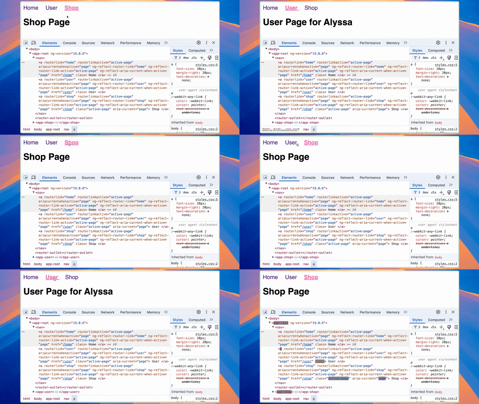
Demo: Watching Aria-Current in Action
Below is a screen recording demonstrating how the active class (active-page) and aria-current attribute update as you navigate between links.

Key Takeaways
✅ Use RouterLinkActive with ariaCurrentWhenActive to make active links accessible.
✅ Check that your active links do have enough visual contrast.
✅ Style active links with more than just color—use bold text, underlines or other distinguishable elements.
3. Test with a Screen Reader to Provide Users Meaningful Feedback
Once you’ve added RouterLinkActive with ariaCurrentWhenActive, it’s important to test how it behaves with a screen reader. Verifying that assistive technologies properly recognize and announce active links is critical to creating an accessible navigation experience.
After adding RouterLinkActive with ariaCurrentWhenActive, I tested the implementation using VoiceOver on my Mac. The improvements were immediately noticeable. For example, I was able to use the Tab key to navigate between links, and when I pressed Enter, the selected link was properly activated. (This didn’t work before.) Additionally, VoiceOver correctly announced the value we set for ariaCurrentWhenActive, stating “Current Page” when the active link was reached.
This made the navigation experience much clearer and more intuitive for users relying on screen readers. Without ariaCurrentWhenActive, there would be no clear indication of the currently active page, leading to potential confusion. The ability to easily determine one’s position in the app is essential for accessibility, and it enhances the overall user experience for those using assistive technologies.
🕰️ Before:
- The
Tabkey could navigate between links, but pressingEnterdid not activate them reliably. - Screen readers did not announce which link was currently active.
✅ After:
- Pressing
Enternow reliably activates links. - VoiceOver correctly announces “Current Page” when the active link is reached.
Given how useful this feature is, I wish that ariaCurrentWhenActive were automatically generated whenever routerLink is used. It would save developers time while equipping better accessibility by default. Until that happens, it’s a best practice to explicitly include ariaCurrentWhenActive whenever implementing navigation in an Angular app.
If you’re ready to start improving accessibility, don’t overthink it—just pick one assistive technology and try it with your product. You’ll likely notice major accessibility gaps right away. And don’t let “testing” freak you out or bog you down—just choose one simple but common task (like navigating your site, signing in or adding something to the cart) and try doing it with an assistive technology active, using only your keyboard instead of your mouse.
Here are a few options to get started. Pick one and spend just 10 minutes testing. That quick effort can reveal insights that will significantly enhance your user experience!
Recommended Assistive Technologies:
🖥 Windows: NVDA (free), JAWS (paid)
💻 Mac: VoiceOver (built-in)
In Chrome
1. Screen Reader Testing Extensions
• ChromeVox – Google’s screen reader for quick tests (not a full JAWS/NVDA replacement)
• Screen Reader – A simple browser-based tool for basic navigation tests
2. Accessibility Audit & Debugging Tools
• Axe DevTools – Best for automated accessibility testing; identifies issues related to screen reader navigation
• WAVE Evaluation Tool – Highlights accessibility errors visually
• Accessibility Insights for Web – Guided testing from Microsoft
• ARIA DevTools – Helps you inspect ARIA attributes to check compatibility with screen readers
3. Simulate Visual Impairments
• NoCoffee Vision Simulator – Helps you see how users with low vision, color blindness or contrast issues experience your app
So for a complete test, you could select one from each category for your browser of choice:
• Axe DevTools or WAVE for an initial audit.
• ChromeVox to test actual screen reader navigation.
• ARIA DevTools to verify proper ARIA attributes.
• (As well as voiceover, for testing from the system’s side)
But again, a step in the right direction is better than looking the other way. So if you just have time for one, then do it!
Step 4: Use Provided A11y Tools
Are you using a component library? If so, I bet they have taken steps (like the Angular team with their aria directive on routes) to help improve accessibility wherever possible. One example of this would be with the Angular component library from Progress Kendo UI. It has a new theme swatch to enhance contrast.
Progress Kendo UI’s A11y Ocean Blue Theme adheres to WCAG 2.1 AA standards:
- Improves color contrast for better readability.
- Adjusts text sizes and spacing for better legibility.
- Works out of the box and can be further customized for specific a11y needs.
So to get started with our Kendo UI A11y theme, first, let’s install it in our project. 🩵
1. Install the desired theme package via npm:
• For the Default theme:
npm install --save @progress/kendo-theme-default2. Include the theme in your project:
a. Using SCSS (recommended for customization):
• Import the entire theme in your main SCSS file (e.g., styles.scss):
@use "@progress/kendo-theme-default/scss/all.scss";• Alternatively, to reduce the CSS size, import only the components you use:
@use "@progress/kendo-theme-default/scss/index.scss";
        @include kendo-button;
        @include kendo-grid;
b. Using precompiled CSS:
• In your angular.json file, add the CSS file to the styles array:
"styles": [
          "node_modules/@progress/kendo-theme-default/dist/all.css",
          "src/styles.css"
          ]
Then, we are going to include the the A11y Ocean Blue swatch on top of the default theme. Here is how:
style.scss
@use "@progress/kendo-theme-default/dist/default-ocean-blue-a11y.scss" as *;
For more detailed information, refer to the Kendo UI for Angular Styling and Themes documentation.
Now, any of our components will have higher contrast, just by enabling this theme.
Final Thoughts: Small Changes, Big Impact
Improving your navigation accessibility doesn’t have to be overwhelming. By implementing just a few key changes—like visually and programmatically indicating active links, testing with a screen reader and leveraging built-in accessibility tools—you can create a more inclusive and user-friendly experience for everyone.
Key Takeaways
✔️ Use RouterLinkActive with ariaCurrentWhenActive to make active links both visually and programmatically identifiable.
✔️ Test your navigation with assistive technologies—even 10 minutes of testing can reveal major accessibility gaps.
✔️ Take advantage of available tools, whether it’s browser extensions, screen readers or high-contrast themes like Kendo UI’s A11y Ocean Blue Theme.
🚀 Next Steps: Pick one thing from this guide—just one—and give it a try. Whether it’s adding ariaCurrentWhenActive, testing your app with a screen reader, or adjusting contrast, any step toward accessibility is a step in the right direction.
The web should be accessible to everyone—let’s build it that way. 🎉

Alyssa Nicoll
Alyssa is an Angular Developer Advocate & GDE. Her two degrees (Web Design & Development and Psychology) feed her speaking career. She has spoken at over 30 conferences internationally, specializing in motivational soft talks, enjoys gaming on Xbox and scuba diving in her spare time. Her DM is always open, come talk sometime.

