
Tailwind CSS and KendoReact Unstyled Mode

Summarize with AI:
Leverage the granular control of Tailwind CSS utility classes and the accelerated development benefits of KendoReact with Unstyled mode.
Tailwind CSS has become a popular tool in modern frontend development due to its utility-first approach to styling. Unlike traditional CSS methodologies that rely on predefined component classes or external stylesheets, Tailwind enables developers to compose styles directly in HTML using utility classes. For a more detailed primer on Tailwind CSS, its advantages and real-world use cases, check out our previous article—A Primer on Tailwind CSS: Pros, Cons and Real-World Use Cases.
In this article, we’ll explore how Progress KendoReact Unstyled mode enables seamless integration with Tailwind CSS. This allows developers to fully customize component styles while retaining the powerful KendoReact powerful UI features.
Where Does Tailwind Fit with Component Libraries Like KendoReact?
While Tailwind CSS provides granular control over styling, UI component libraries like KendoReact streamline development by offering prebuilt, feature-rich components. These libraries allow developers to implement accessible, interactive UI elements out of the box allowing for customization. To see the difference between using Tailwind or a component library like KendoReact, let’s quickly illustrate what it would take to create a simple <button> element.
In Tailwind CSS, we apply utility classes directly to an HTML button element:
<button
  className="bg-blue-500 text-white font-bold py-2 px-4 rounded-lg hover:bg-blue-600 transition duration-300"
>
  Click Me
</button>
Each class used in the example above is a utility from the Tailwind library. This approach provides fine-grained control, so the button looks precisely as we define it, without external styles interfering.
With KendoReact, we use a prebuilt React Button component:
import { Button } from "@progress/kendo-react-buttons";

const KendoButton = () => {
  return <Button type="button">Click Me</Button>;
};

export default KendoButton;
In the above example, the Button component from KendoReact comes with built-in styles, accessibility features and predefined behaviors, allowing developers to quickly implement a polished and consistent button without manually applying utility classes.
By default, KendoReact components have predefined styles for a polished and consistent UI. However, there are cases where developers need more control over the appearance of components (e.g., to use utility-based CSS frameworks like Tailwind CSS). This is where KendoReact Unstyled mode comes into play.
Unstyled Mode in KendoReact
Unstyled mode allows developers to use KendoReact components while replacing the built-in styling, giving them full control over the component’s appearance. By disabling or modifying the default styles, we can apply custom classes—including those from Tailwind—to style the components according to our needs.
To enable Unstyled Mode in KendoReact, we can wrap the desired components inside the UnstyledContext.Provider. This allows us to pass a set of custom class names and styles that dictate how the components will be rendered. For example, when working with the React Form component, we can customize its structure and appearance without relying on built-in KendoReact styles:
import { UnstyledContext } from '@progress/kendo-react-common';
import { formPreset } from './form-preset';

<UnstyledContext.Provider value={formPreset}>
  <Form .../>
</UnstyledContext.Provider>
In the above example, the formPreset object acts as a configuration that defines how different form elements should be styled. It is a structured set of class names that determines the appearance of the form component in various states and configurations. Here’s an example of how this configuration can be structured:
const formPreset = {
  uForm: {
    form: {
      main: "border-0",
      size: {
        small: "mt-2",
        medium: "mt-5",
        large: "mt-[1.125rem]",
      },
    },
    field: {
      main: "flex",
    },
    // ...
  },
  uButton: {
    wrapper: {
      main: "px-3 py-2 rounded-md shadow-sm",
      size: {
        medium: "px-2 py-1",
        large: "px-3 py-2",
      },
      themeColor: {
        primary: "bg-primary text-white hover:bg-primary-hover",
      },
    },
    // ...
  },
  // ...
};

export { formPreset };
In the above formPreset configuration, Tailwind utility classes are applied to different elements of the form, uForm and uButton, allowing fine-grained control over the styling of form and button elements.
Building on this foundation, here’s a more complete example of a KendoReact form using Tailwind for styling:
import React from "react";
import { Button } from "@progress/kendo-react-buttons";
import { SvgIcon, UnstyledContext } from "@progress/kendo-react-common";
import {
  Field,
  FieldWrapper,
  Form,
  FormElement,
} from "@progress/kendo-react-form";
import { InputClearValue, TextBox } from "@progress/kendo-react-inputs";
import { Label } from "@progress/kendo-react-labels";
import { xIcon } from "@progress/kendo-svg-icons";
import { formPreset } from "./form-preset";

const FormTextBox = (fieldRenderProps) => {
  const { name, label, placeholder } = fieldRenderProps;
  const [value, setValue] = React.useState("");
  const handleChange = (e) => {
    setValue(e.value);
  };
  const clearClick = () => {
    setValue("");
  };
  return (
    <div
      className="block"
      style={{
        width: "100%",
      }}
    >
      <Label>{label}</Label>
      <TextBox
        placeholder={placeholder}
        name={name}
        value={value}
        onChange={handleChange}
        suffix={() => (
          <InputClearValue onClick={clearClick}>
            <SvgIcon icon={xIcon} />
          </InputClearValue>
        )}
      />
    </div>
  );
};

const App = (_props) => {
  return (
    <section>
      <UnstyledContext.Provider value={tailwindForm}>
        <br />
        <Form
          render={(_formRenderProps) => {
            return (
              <FormElement>
                <div className="grid gap-x-4 gap-y-3 sm:grid-cols-2 grid-cols-1">
                  <FieldWrapper className="col-span-1">
                    <Field
                      placeholder="Glen"
                      name="firstName"
                      label="First Name"
                      component={FormTextBox}
                    />
                  </FieldWrapper>
                  <FieldWrapper className="col-span-1">
                    <Field
                      placeholder="glen_stracke@email.com"
                      name="email"
                      label="Email"
                      component={FormTextBox}
                    />
                  </FieldWrapper>
                </div>
                <div className="p-0 overflow-visible border-t mt-5 border-base">
                  <Button themeColor={"primary"} className="form-button">
                    Book a slot
                  </Button>
                </div>
              </FormElement>
            );
          }}
        />
      </UnstyledContext.Provider>
    </section>
  );
};

export default App;
The formPreset configuration is imported and passed to UnstyledContext.Provider to apply custom styles. The form fields are styled using Tailwind classes for consistent spacing and layout, while FieldWrapper components offer proper form alignment. The submit button is also customized using Tailwind’s utility classes and KendoReact’s themeColor.
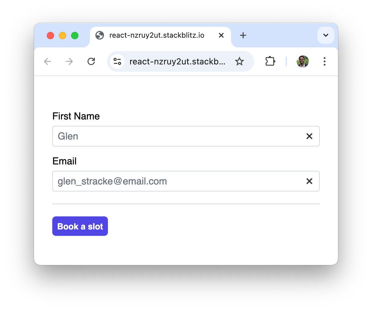
Our form example leverages Tailwind for customization while retaining KendoReact’s functionality!
Wrap-up
Using Tailwind CSS with KendoReact Unstyled mode gives developers complete control over component styling while still leveraging the powerful features of a UI component library. This approach enables teams to maintain design consistency while benefiting from Tailwind’s utility-first methodology. However, it’s important to consider the trade-offs. Applying custom styles requires additional setup, and maintaining consistency across a large project can become challenging without careful organization.
Unstyled mode is currently supported only for specific KendoReact components, including React Animations, React Buttons, several React Date Inputs and React Form. You may need alternative styling approaches if your project relies on other KendoReact components that do not support Unstyled mode. For a full list of supported components and more details, visit the KendoReact Unstyled mode documentation.
And to explore it for yourself, download a free 30-day trial!

Hassan Djirdeh
Hassan is a senior frontend engineer and has helped build large production applications at-scale at organizations like Doordash, Instacart and Shopify. Hassan is also a published author and course instructor where he’s helped thousands of students learn in-depth frontend engineering skills like React, Vue, TypeScript, and GraphQL.
Related Posts
Comments
All articles
Topics
Web MobileMobile
Desktop
Design
Productivity
People
