Splash Screen in .NET MAUI

Summarize with AI:
Our app’s splash screen is our “first impression” to our users, usually including the app’s name, logo and branding colors. Learn how to create a splash screen in .NET MAUI.
One of the first “steps” we usually take when meeting someone is to introduce ourselves. Typically, we share our name and perhaps a bit more about who we are. The same concept is true with applications—they also create a first impression, and this is where the splash screen comes in.
The splash screen is that “first impression” we present to our app users. It’s an opportunity to showcase the app’s name, logo and branding colors. In more specific terms, the splash screen is a welcome or introductory screen displayed at the start of an application.
Oh, so is it just an introduction? Not at all! It also serves as a useful interaction or distraction for the user while our application loads all the necessary processes to start. This prevents users from feeling the full weight of the initial waiting time. Imagine leaving them staring at a blank screen with no feedback while the app loads—it can be quite frustrating! The splash screen makes the experience smoother and more professional.
Now that we have a much clearer understanding of what a splash screen is, in this article, we’ll learn how to work with it in .NET MAUI.
How Do I Add a Splash Screen to My Project?
Working with the splash screen is simple! Follow these steps:
1. Add the Image
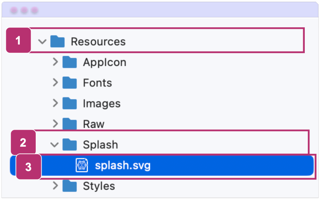
Go to your project and navigate to the Resources/SplashScreen folder. Simply paste the image you want to use for your splash screen here.

⚠️ When starting a new project, it includes a default image named splash.svg. Here are two recommended approaches:
- Add an image with a different name: You can add a new .svg file and remove the default splash.svg to avoid unnecessary resources in your project.
- Or replace the default image: Alternatively, you can replace the default image by naming your new file splash.svg, allowing it to automatically overwrite the original.
When naming this image, the name should adhere to the following rules to comply with Android’s resource naming conventions:
- It must be in lowercase.
- It must begin and end with a letter.
- It may only contain alphanumeric characters or underscores.
2. Set the Build Action
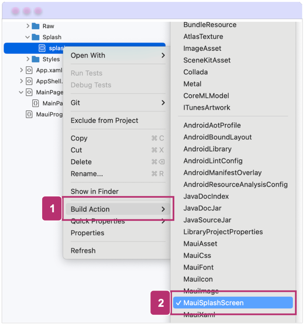
After adding the image, right-click on it, select Build Action and then choose MauiSplashScreen value.

And that’s it! Once you do this, a line will be added to the project file referencing the image you added, like the following:
<ItemGroup>
  <MauiSplashScreen Include="Resources\Splash\splash.svg" />
</ItemGroup>
Here’s an example I created with the Telerik logo, featuring a white background:

🌟 Bonus: How to Set the Background Color and Tint the Splash Screen Logo
To enhance the design of your splash screen, you can set the background color of your choice using the Color property, followed by the color value you prefer. You also have the option to tint the logo of the splash screen using the TintColor property, which is especially useful for simple images when you want to change their color temporarily without altering the original.
In code, it would look like this:
<MauiSplashScreen Include="Resources\Splash\splashscreen.svg" TintColor="#66B3FF" Color="Pink" />
How Does Splash Screen Work?
By navigating to the Resources ➡️ SplashScreen folder, you’ll find the location of the splash screen for the entire project. This file enables the automation of resizing, so the splash screen adjusts to the various resolutions required for each platform or device. This resized screen is then added to your application’s package.
To learn how to prevent splash screen packaging, refer to the section on disabling splash screen packaging.
Unlike previous approaches in Xamarin, where we had to provide separate images for each dimension (such as HDPI, MDPI, etc.), .NET MAUI streamlines the process by handling this automatically with just the base image.
Some important points to keep in mind regarding image handling in .NET MAUI:
- You can use any standard image format, such as PNG, JPEG or SVG.
- If you’re using SVG files, keep in mind that when referencing them in XAML or C#, you’ll need to use the .png extension instead of .svg.
- The only place where the SVG file is mentioned directly is in the .csproj file, where its usage is defined.
- .NET MAUI automatically converts SVG files to PNG during the build process.
✍️ Whenever possible, opt for SVG images, as, unlike bitmap-based formats like PNG or JPG, which may appear blurry when scaled. SVGs can be enlarged to any size without losing quality.
Base Size
As mentioned in the previous paragraphs, each device and platform can have different dimensions. That’s why .NET MAUI allows you to define a base size for the image used in the splash screen. This base size serves as a reference point, enabling the image to be automatically resized according to the requirements of each device. This means the image can be adjusted to smaller or larger sizes, but it will always use the base size as the reference.
Here are some important points to consider:
- For bitmap images (such as PNG or JPEG): It is essential to define a base size so that .NET MAUI can automatically resize the image. Without it, the image may not adjust properly across all platforms.
- For vector images (such as SVG): If a base size is not defined, .NET MAUI will use the dimensions specified within the SVG file as the default base size.
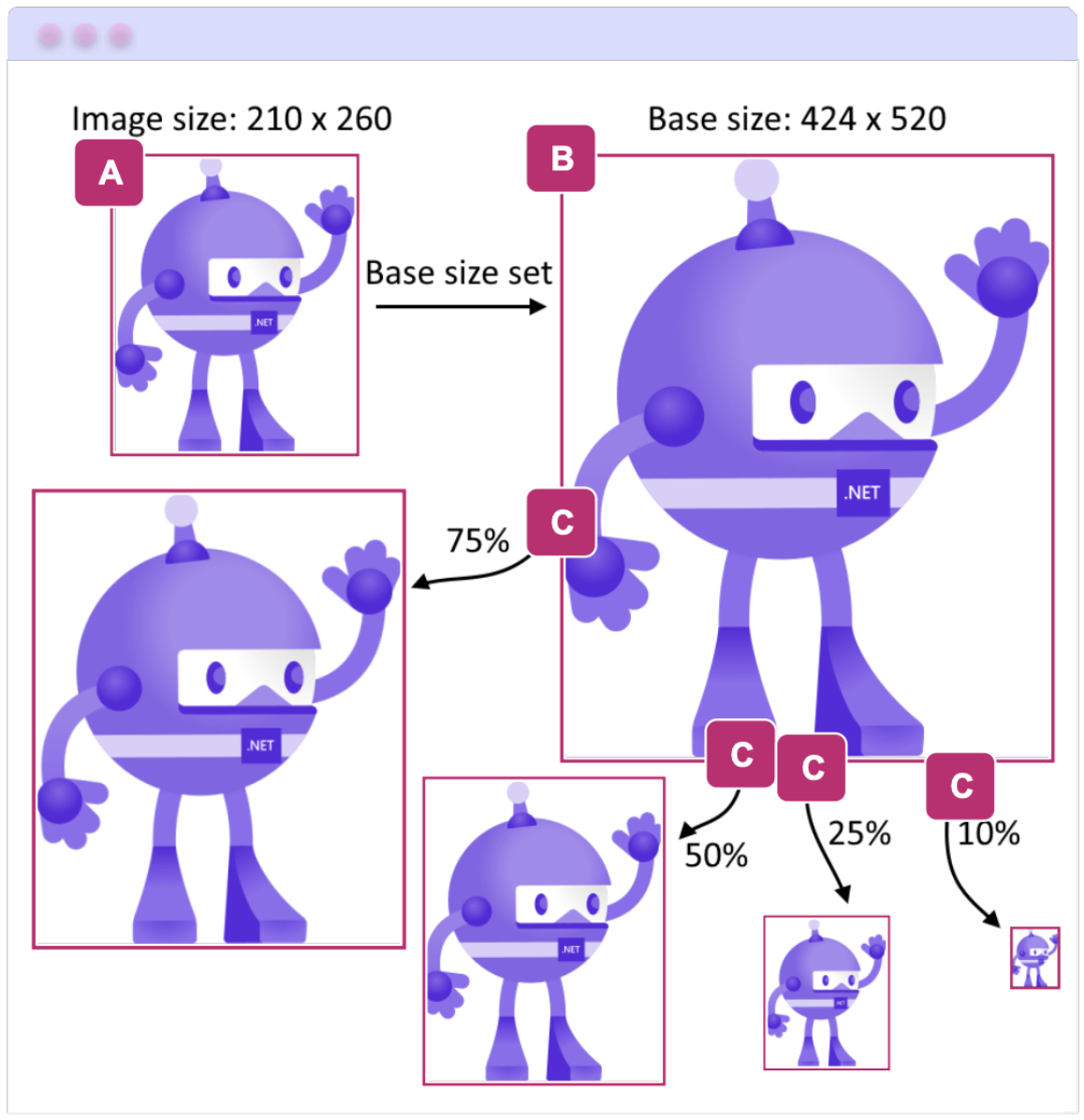
Let’s see the following sample:

This image was sourced from the official documentation, with some modifications made to the colors and overall look and feel.
Image B establishes the base size from which all other required dimensions are derived. Its dimensions are set to 424 x 520. Referencing this base size, the following adjustments are made:
- A: Starting from the base size of 424 x 520, the image is scaled down to 210 x 260.
- C: For various platforms, different image sizes are required. To meet these needs, the image is resized to multiple dimensions, always using the base size of 424 x 520 as the reference.
How to Set the BaseSize?
Simply add the BaseSize property to the SplashScreen, specifying the dimensions where the first value represents the width and the second represents the height.

Here’s how it looks in code:
<MauiSplashScreen Include="Resources\Splash\splashscreen.svg" BaseSize="128,128" />
At compile time, as mentioned earlier, the splash screen automatically adjusts to match the resolution of the target device. If you want to prevent this behavior, you can set the Resize property to false. Here’s an example of how to configure this:
<MauiSplashScreen Include="Resources\Splash\splashscreen.svg" Resize="false" />
Platform-Specific Configurations
 Android
On Android, the splash screen is added to your app package represented by two files:
- Resources/values/maui_colors.xml: Defines the colors used in the splash screen
- Resources/drawable/maui_splash_image.xml: Contains the reference to the image used as the splash screen icon
This splash screen is automatically displayed in your app thanks to the default .NET MAUI theme, Maui.SplashTheme. Therefore, your MainActivity class should look like the following example:
using Android.App;
using Android.Content.PM;

namespace MauiSampleApp
{
    [Activity(Theme = "@style/Maui.SplashTheme", MainLauncher = true, ConfigurationChanges = ConfigChanges.ScreenSize | ConfigChanges.Orientation | ConfigChanges.UiMode | ConfigChanges.ScreenLayout | ConfigChanges.SmallestScreenSize)]

    public class MainActivity : MauiAppCompatActivity
    {
    }
}
 iOS
iOS
In iOS, the splash screen is automatically included in the app package as a storyboard named MauiSplash.storyboard. This is reflected in the Info.plist file, where it is set as the value of the UILaunchStoryboardName key. (⚠️ You don’t need to add it manually; this is just to help you understand how it works.)
Here is an example of what the info.plist would look like:
<?xml version="1.0" encoding="UTF-8"?>

    <!DOCTYPE plist PUBLIC "-//Apple//DTD PLIST 1.0//EN" "http://www.apple.com/DTDs/PropertyList-1.0.dtd">
    <plist version="1.0">
    <dict>
    ...
    <key>UILaunchStoryboardName</key>
    <string>MauiSplash</string>
    ...
    </dict>
</plist>
✍️ Points to Keep in Mind
- On Android 12+ (API 31 and above), the splash screen features a centered icon. You can see more information here.
- In iOS 16.4 and later, simulators won’t display a splash screen unless your app is signed. For more details, check out this information.
Wrap-up
That’s all! 🤩 Now you have a deeper understanding of what a splash screen is, how to implement it and how it works in .NET MAUI. You’re now better equipped to tailor it perfectly to your applications!
Thanks for reading this article! 💚💕
See you next time! 🙋♀️
References
This article was based on the official documentation.

Leomaris Reyes
Leomaris Reyes is a software engineer from the Dominican Republic specializing in mobile development. She is a 7-time Microsoft MVP and actively builds mobile applications while sharing practical knowledge through technical articles and developer-focused content.
Through her work, she explains programming concepts, developer tools and real-world development practices to help developers grow in their careers.
You can follow her on Instagram and TikTok at @leomarisreyes.dev, read her articles on AskXammy, and connect with her on LinkedIn, where she shares tutorials, insights and resources for developers.

