Overview of Color
Color is a powerful communication instrument in every interface design. It allows you to activate the visual perceptions of the user and deliver a message at first sight. It creates a visual hierarchy and draws the viewer's eye to key components and actions, such as highlighting call-to-action buttons. Consistent use of color promotes brand recognition and reinforces identity through specific palettes that reflect a brand's values. In addition, appropriate color contrasts are critical to ensuring that all users, including those with visual impairments, can interact effectively with the content.
Play with Colors
Discover how color changes an interface's look and feel with our interactive demo. Click the color button to adjust the primary hue and observe its immediate effect on key components. This live demo vividly demonstrates color's significant role in design, offering you a direct experience of its transformative power.
Basic Concepts
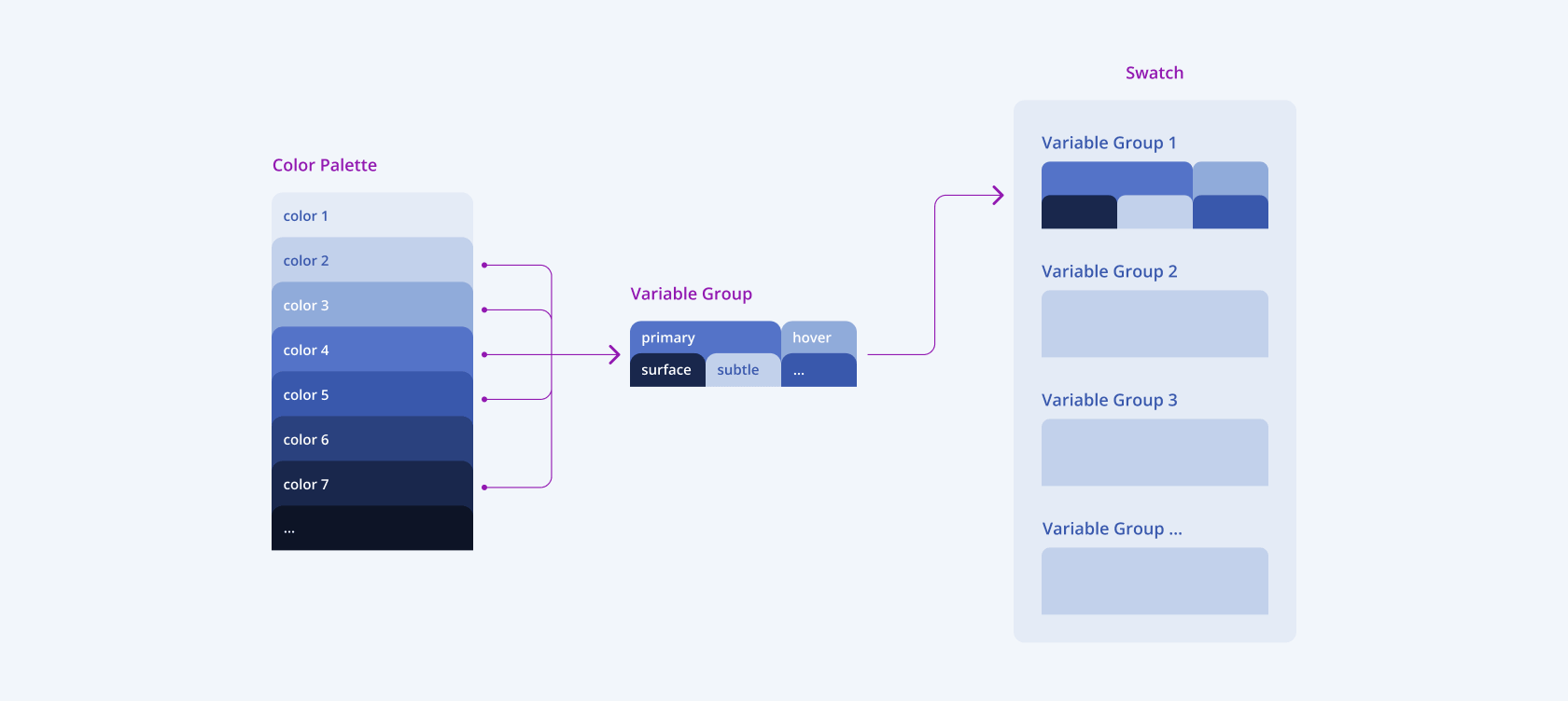
The concept of the Telerik and Kendo UI color system comprises three key elements: Color Palettes, Variable Groups, and Swatches. Each of them plays an essential role in defining the visual language:
- Color Palettes are a collection of carefully selected color tones used to supply colors to the Variable Groups.
- Variable Groups assign specific uses to each color based on its name, ensuring it is applied accurately across different UI elements. For example, the Primary group in the image below.
- Swatches are formed by various Variable Groups that are categorized based on their distinct use.
This approach allows for both aesthetic consistency and functional clarity. By systematically aligning colors with their intended use, the theme's color system creates a streamlined, intuitive design process that allows designers to create interfaces that are both visually appealing and user-centric.

Key Color Principles
The Telerik and Kendo UI color system endorses several basic principles:
- Visual hierarchy and communication—Color supports the purpose of the content and indicates how elements relate to each other.
- Color for emphasis—Color attracts attention and highlights primary actions.
- Simple minimal palette—To avoid confusion and cognitive load, color is used sparingly.
- Colors have meaning—Colors carry a specific meaning based on how they function within the interface.
- Legibility and Readability—Text, icons, and other elements must meet the contrast minimums specified by the accessibility standards.
Implementation through Tokens
Color design tokens allow you to give a name to a hard-coded color value and ensure flexibility and unity across the design system. You can apply design tokens to every color-related element such as background color, text color, border color, and so on. Using color design tokens enables you to scale every color change. For example, by changing the value of a color token, you update every element that uses the changed token, thus enabling you to apply changes globally.

For more information, see the Design Tokens page.
Color and Accessibility
While colors can bring a specific mood and set the conversational tone, you must also consider two other qualities of color, especially when creating an accessible design—contrast ratio and the ability to convey information accessibly.
Color Contrast
Color contrast is the difference between the brightness of the text or graphic and the brightness of the background color behind them. This difference is expressed as a ratio ranging from 1:1 (white on white) to 21:1 (black on white). In the context of accessibility, the higher the contrast ratio, the more readable your content is for color-blind or visually impaired users.
Conveying Information with Color
To convey information in an accessible manner, never use color as the only visual means to indicate status, prompt a response, or distinguish a visual element. Many people see color differently and you risk that they don't recognize the specific function and meaning of a given color. To be accessible to everyone, your designs must be color-agnostic and always feature a backup communication mechanism:
- To deliver an error message, use symbols or icons along with colors.
- Add text labels to the messages.
- Choose the colors wisely and test them to verify that people with vision deficiencies can differentiate them.
For more information, see the Accessibility page.
Theme-Specific Variables
For specific information about the color system, refer to the theme-specific variables list:


