The component icons for the Telerik and Kendo UI themes require you to follow some basic principles that make your design user-friendly and effective.
Rendering Modes
The Web Components Icons font offers some of its icon sets in both fill and outline modes.
Keep the consistency of the fill mode within the icons sets.
Avoid mixing different fill mode styles in a single icon set
Icons and Labels
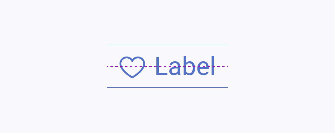
Usually, icons are used in a combination with label text. The vertical rhythm is essential for the easier perception of the elements.
The icon and the textual content within a component must be vertically aligned and centered.
Avoid aligning the bottom of the icon with the baseline of the text.
Creating New Icons
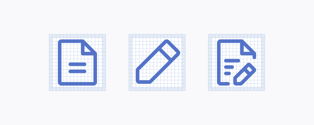
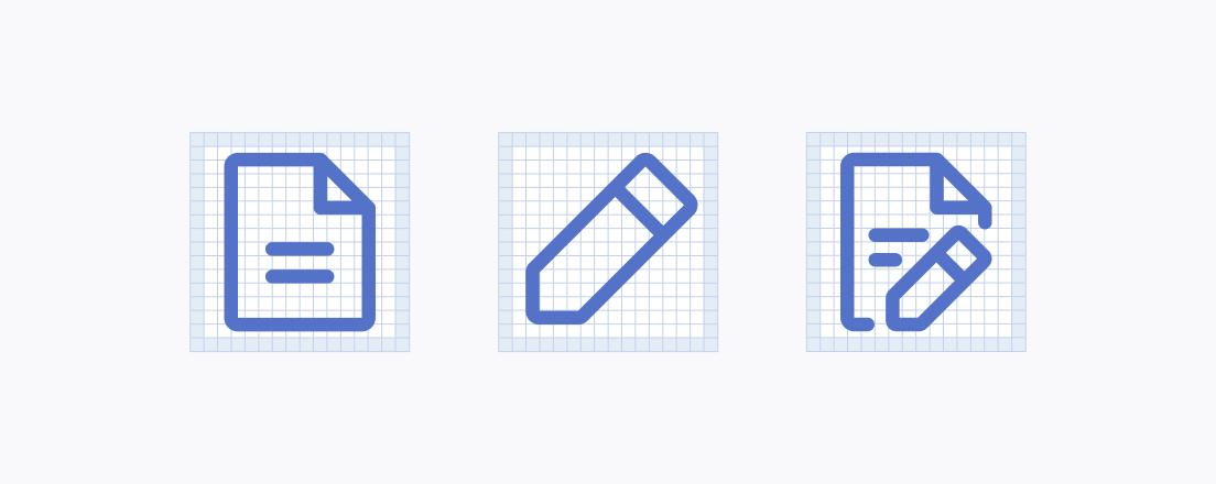
An icon set consists of multiple icons that stem from the same base graphic. To create new icons for the icon set, you add or remove elements from the base graphic.
Icons of the same type must have the same proportions and ratios—this makes them look consistent when placed next to each other.
Avoid changing the scaling when making icon variations for an icon set. When placed next to each other or when used as a togglable option, icons must not have a different size.
Adding Modifiers
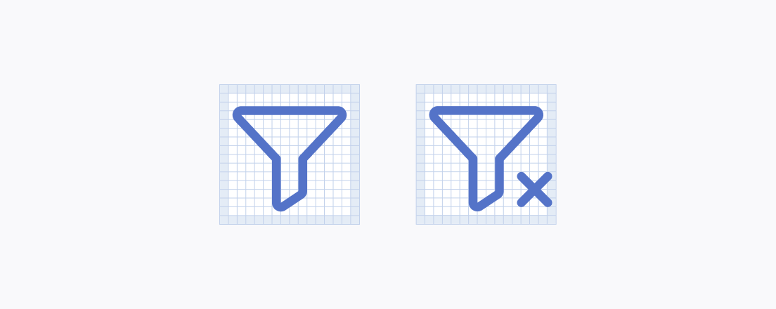
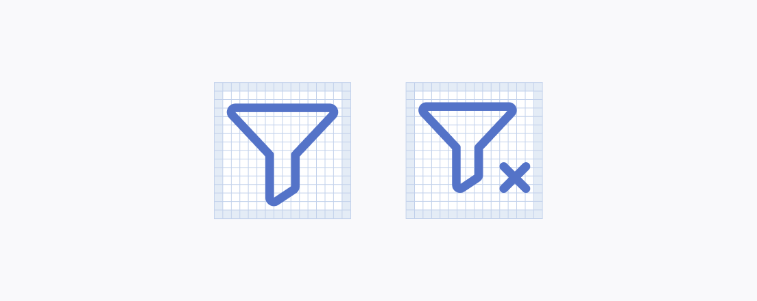
Treat modifiers as secondary elements, balancing their size and prominence visually so they never disrupt the primary icon's structural hierarchy.
Keep the modifier smaller than the primary icon to preserve the visual hierarchy.
Avoid making an icon's modifier large enough to obscure or confuse which element holds primary importance.